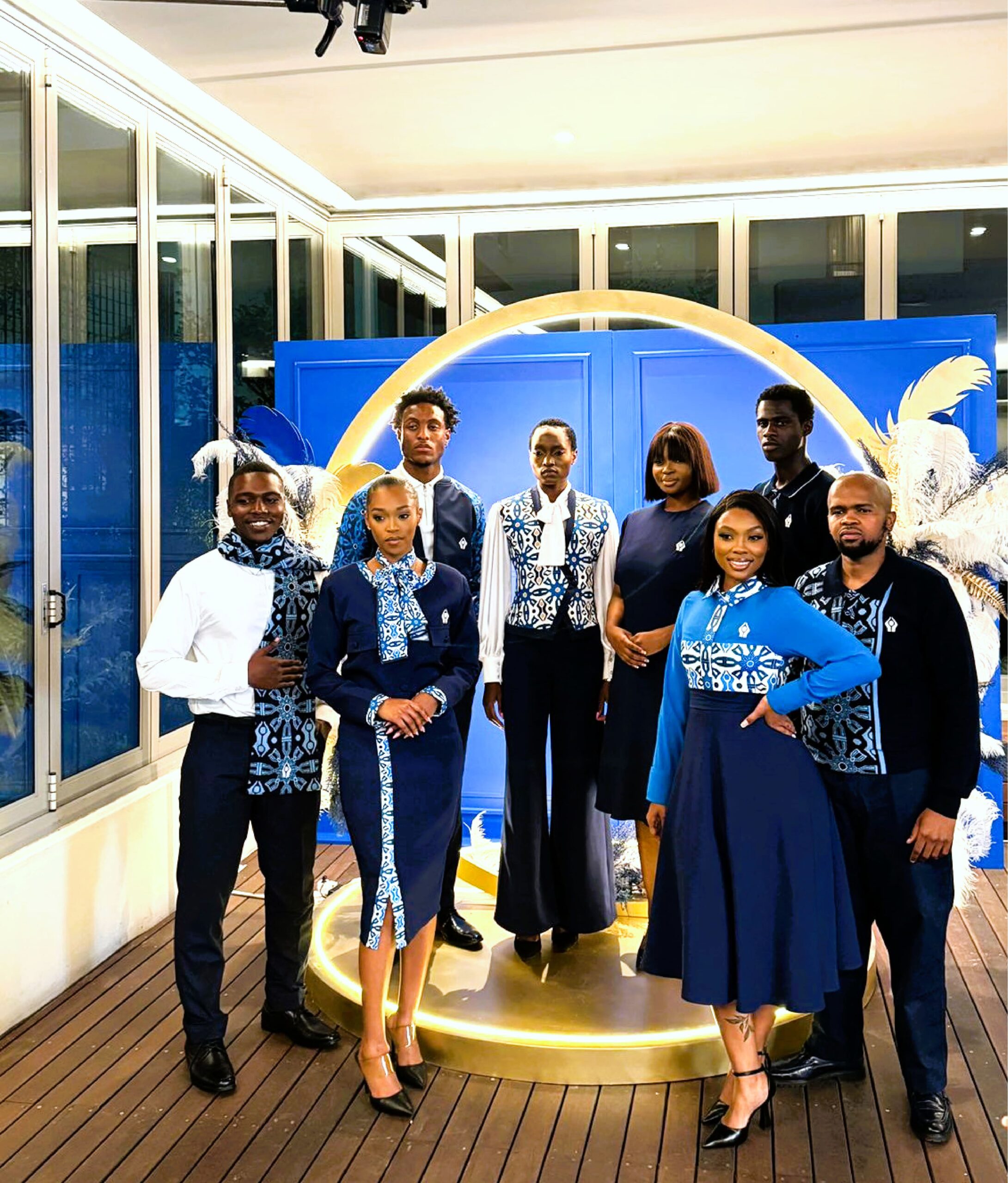
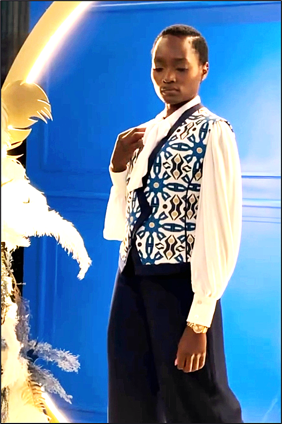
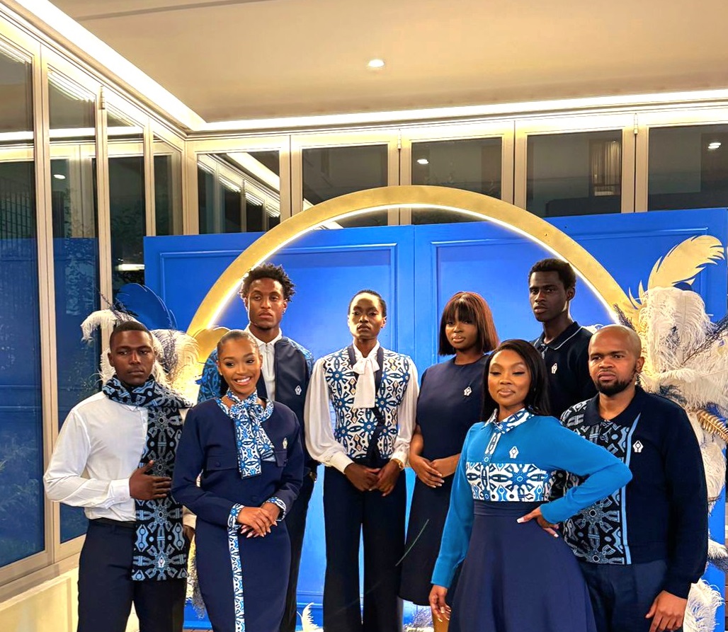
SANLAM UNIFORMS
SANLAM’S brand identity has always comprised circles and 2 hands that hold a life or future that is secured. The SUNRISE symbolizes new beginnings& a bright future; it encapsulates life and positive energy.
Our inspiration stems from 2 sources, namely the circular shape of the sun and its rays as the most important source of energy in our lives. We also turned to an ancient stone calendar located in Mpumalanga, known as Inzalo ye Langa, which is said to be the oldest calendar, dating back to 200 000 years ago. The Calendar consists of stones that have been strategically placed to align with the sun, stars and even some planets. This alignment of the stones allows the sun to cast shadows onto the stones, which then indicate the longest night and shortest day of the year, when day and night are equal, when the Autumn/Winter season begins and when the spring equinox (African new year) occurs.
Photo Credits _Sanlam, Fabrosanz, Renaissance Design
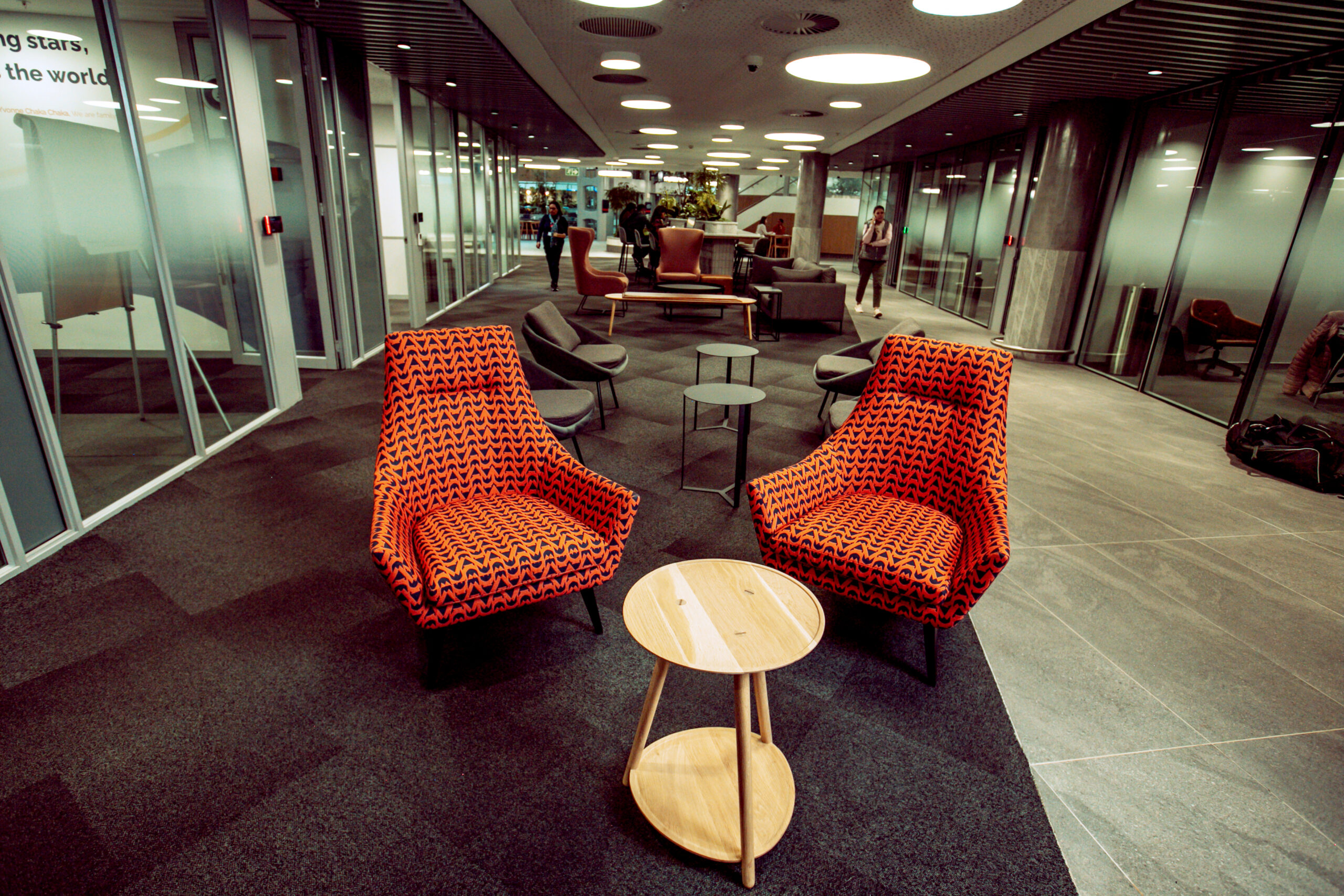
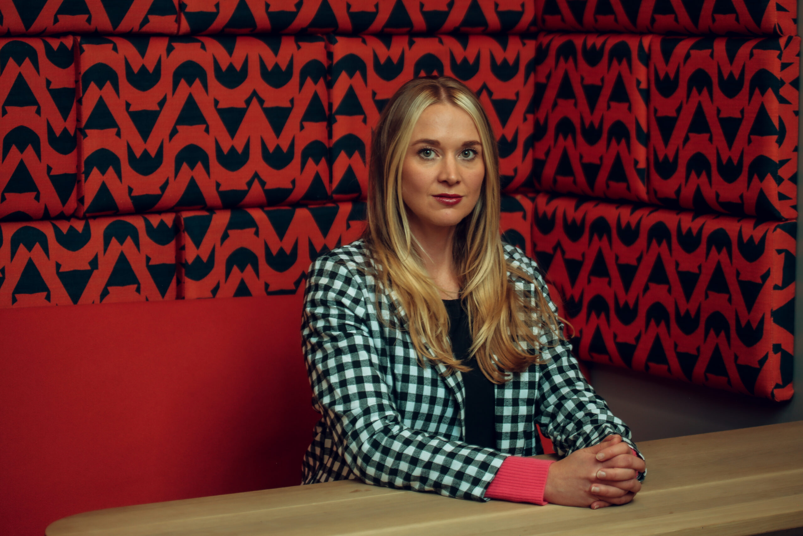
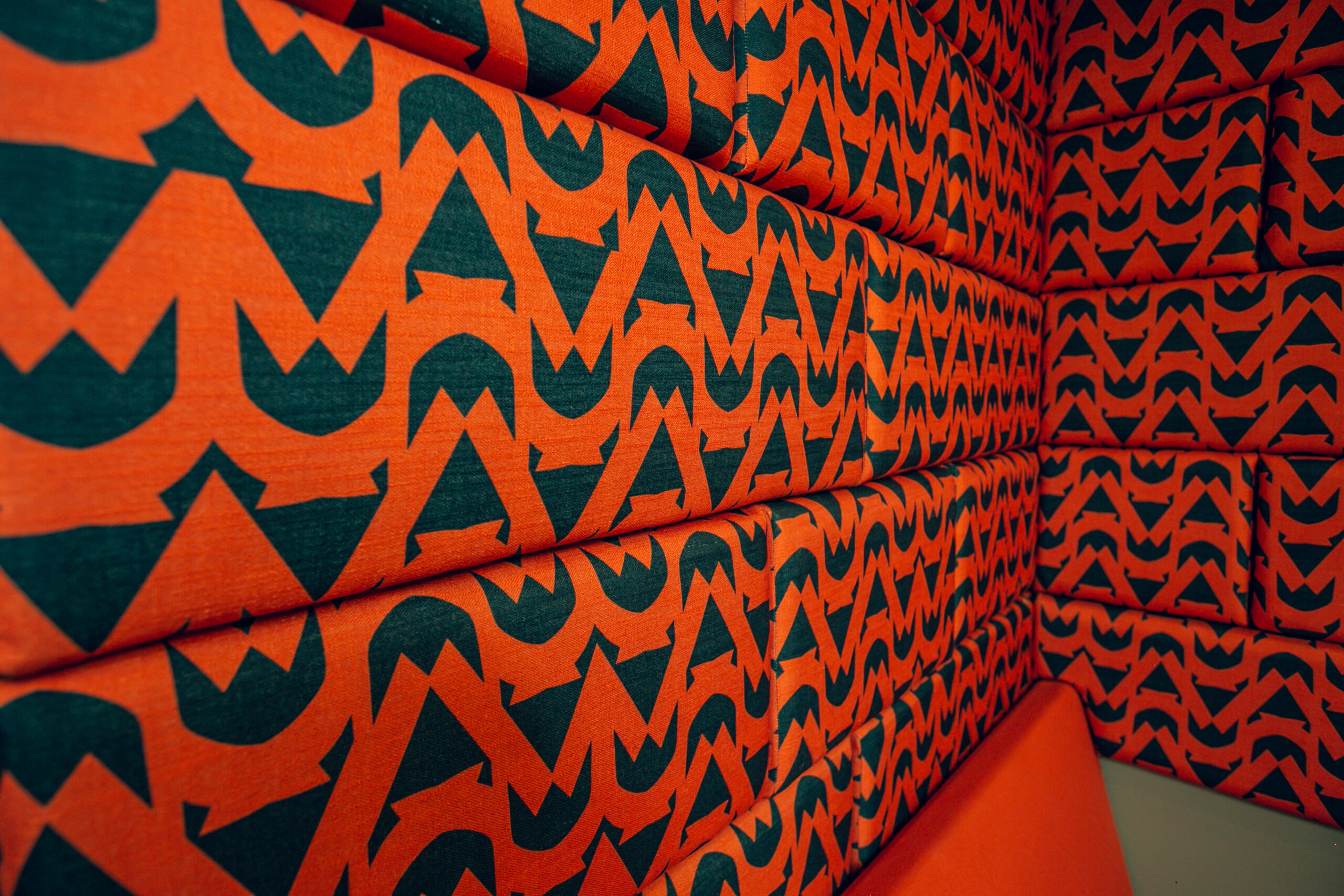
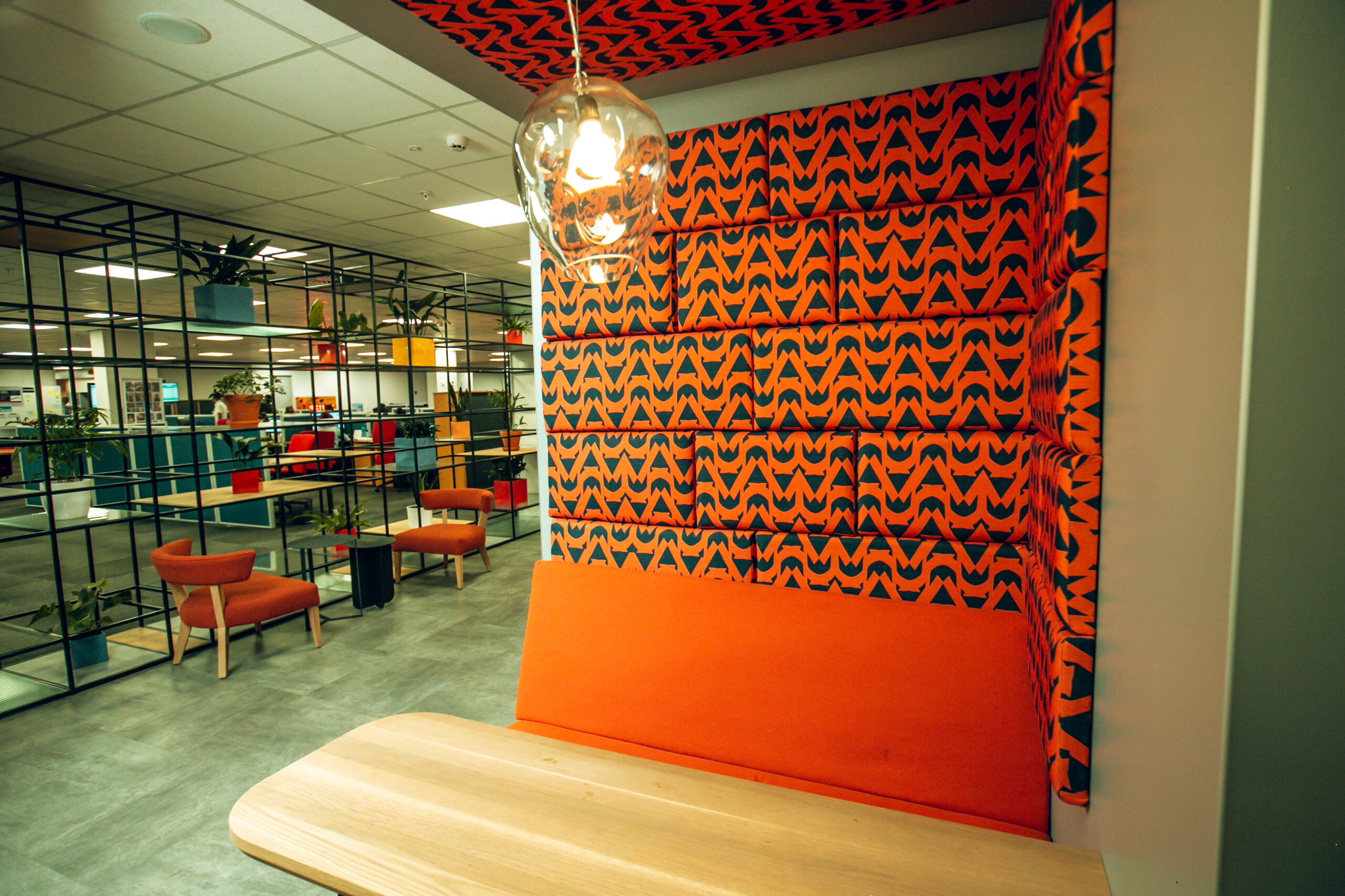
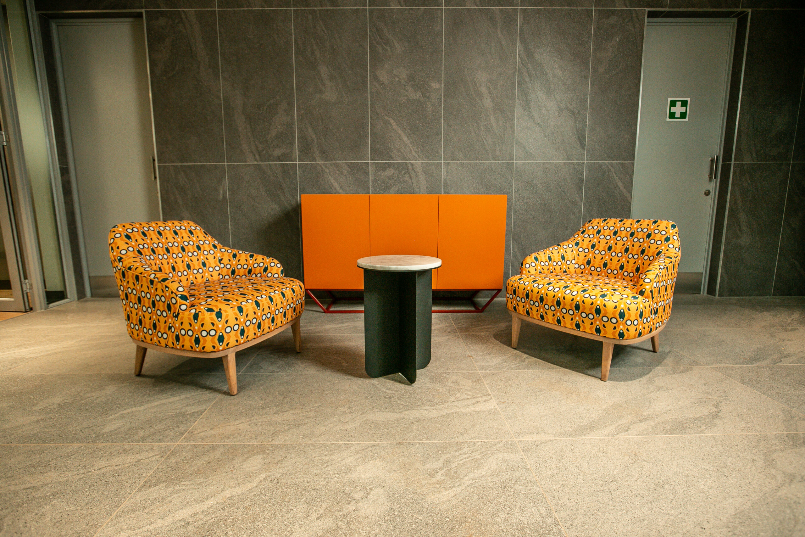
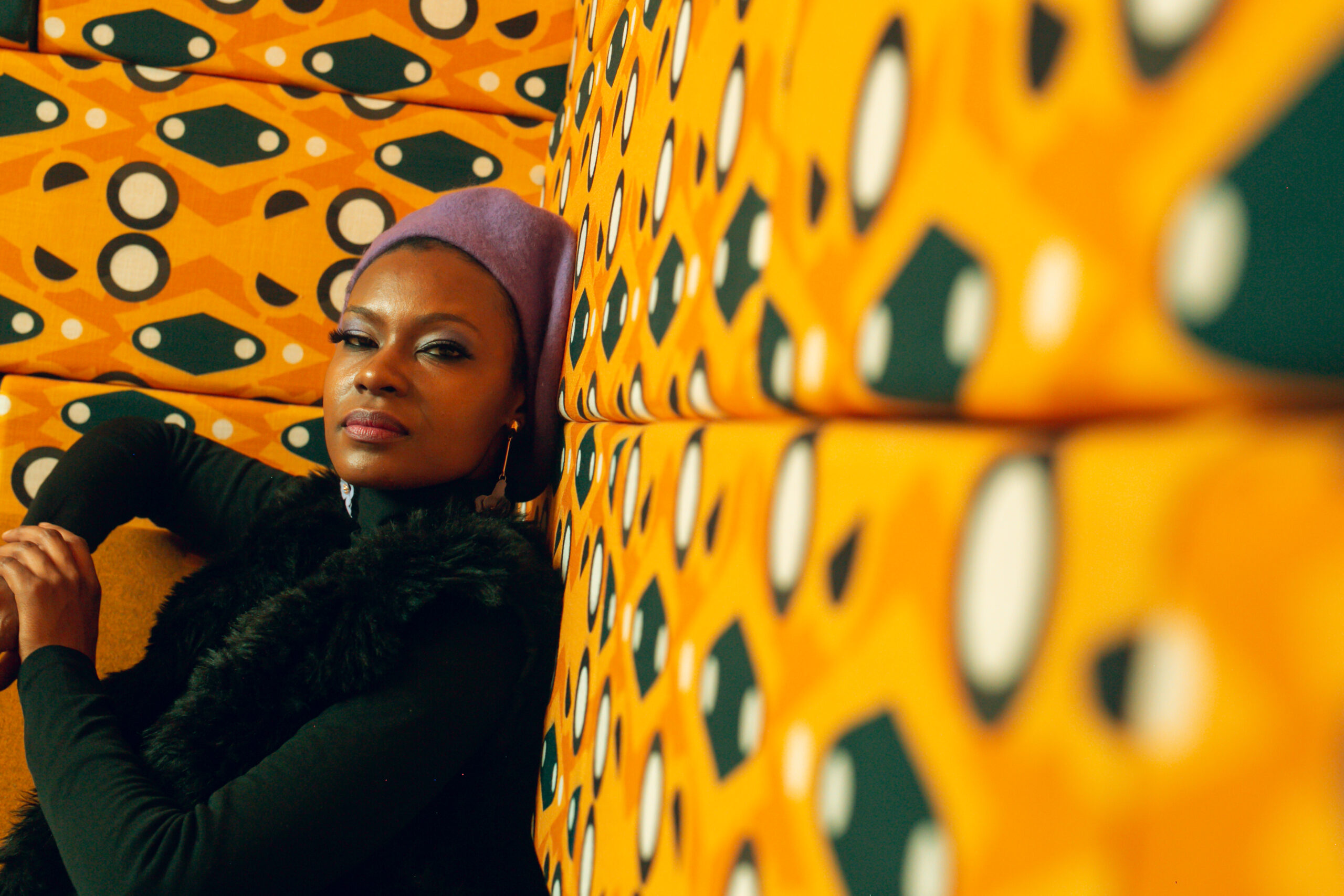
METROPOLITAN
The Metropolitan pattern was inspired by the DNA of this generational brand’s logo. A brand which is for the People rooted in the upliftment of communities. The use of one half of the logo is a celebration of this generational brand, which many South Africans have grown with and have trusted over many years. I personally grew up with this logo in our household, and whenever my mother would speak about life policies, the logo would remain as a reminder of their hard work and efforts to secure our futures.
Therefore, this pattern represents the generational security, community building and peace of mind that is created through enabling one person or generation to assist the next. Upholstery Fabrics printed and installed by Fabric Bank
Photo credits _FABRIC BANK & Zac Modirapula
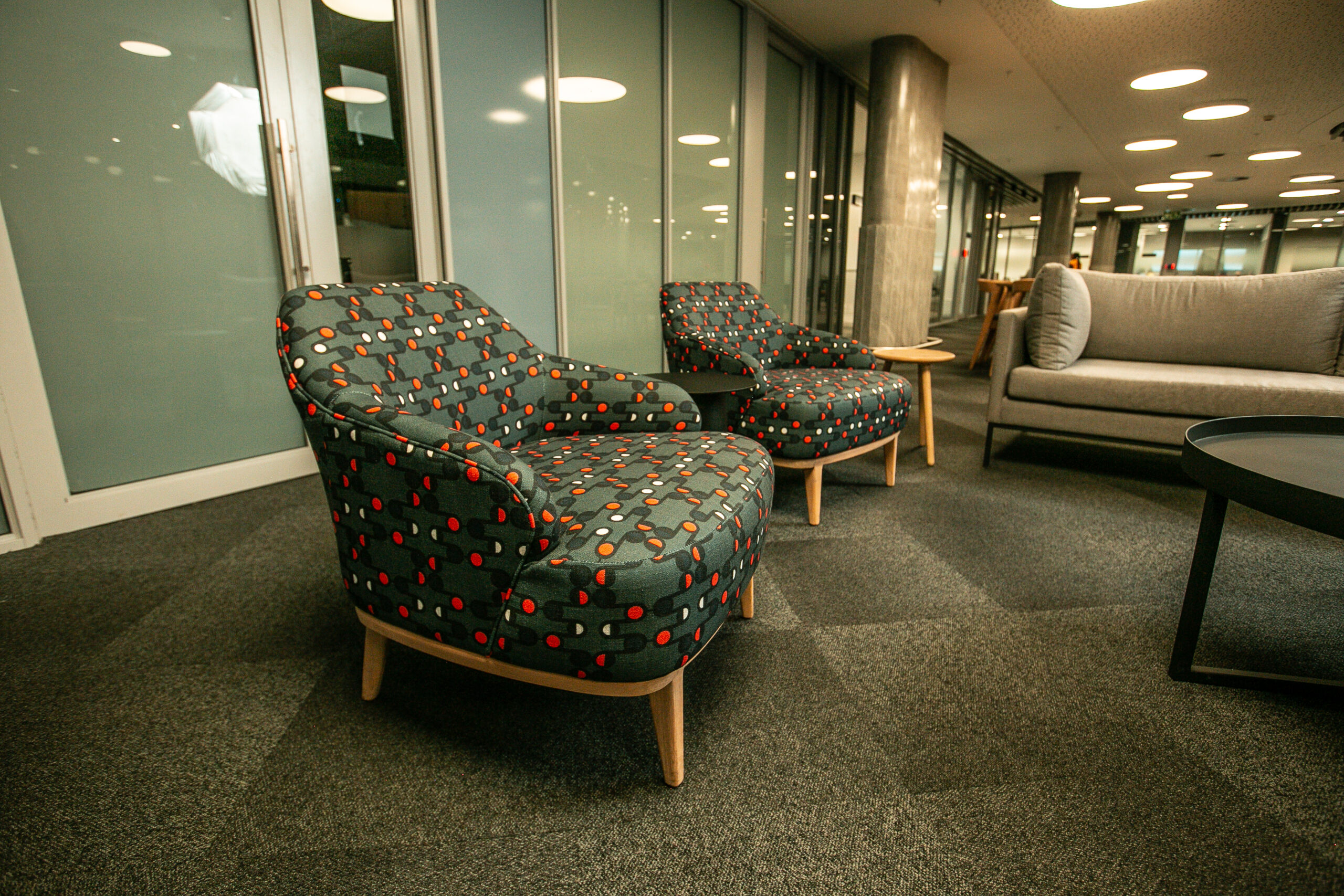
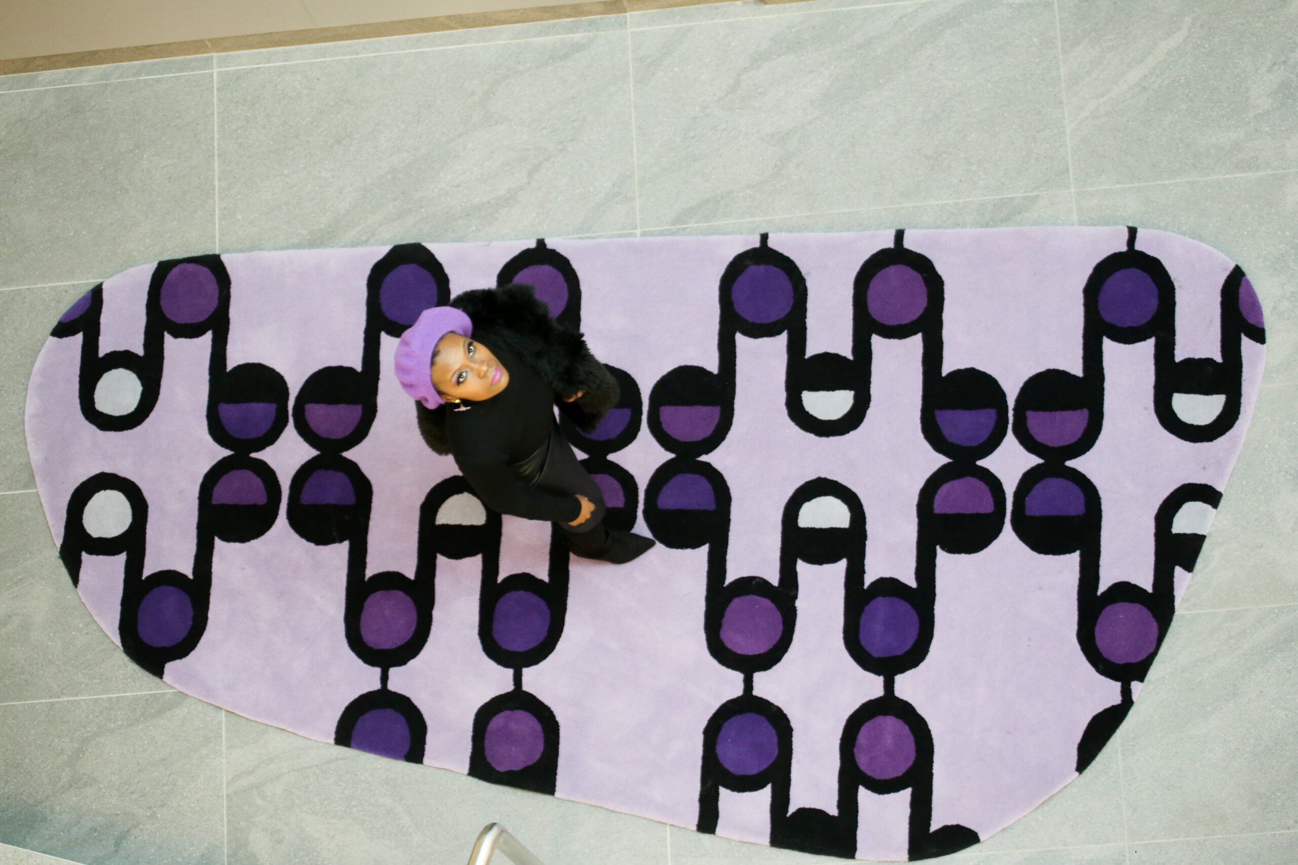
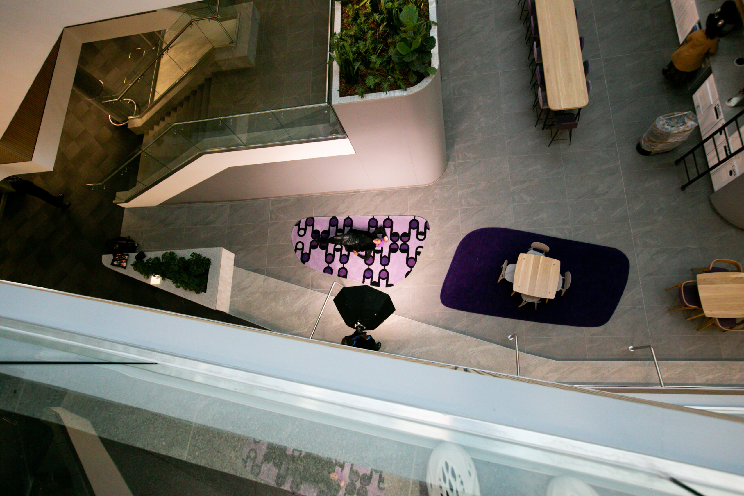
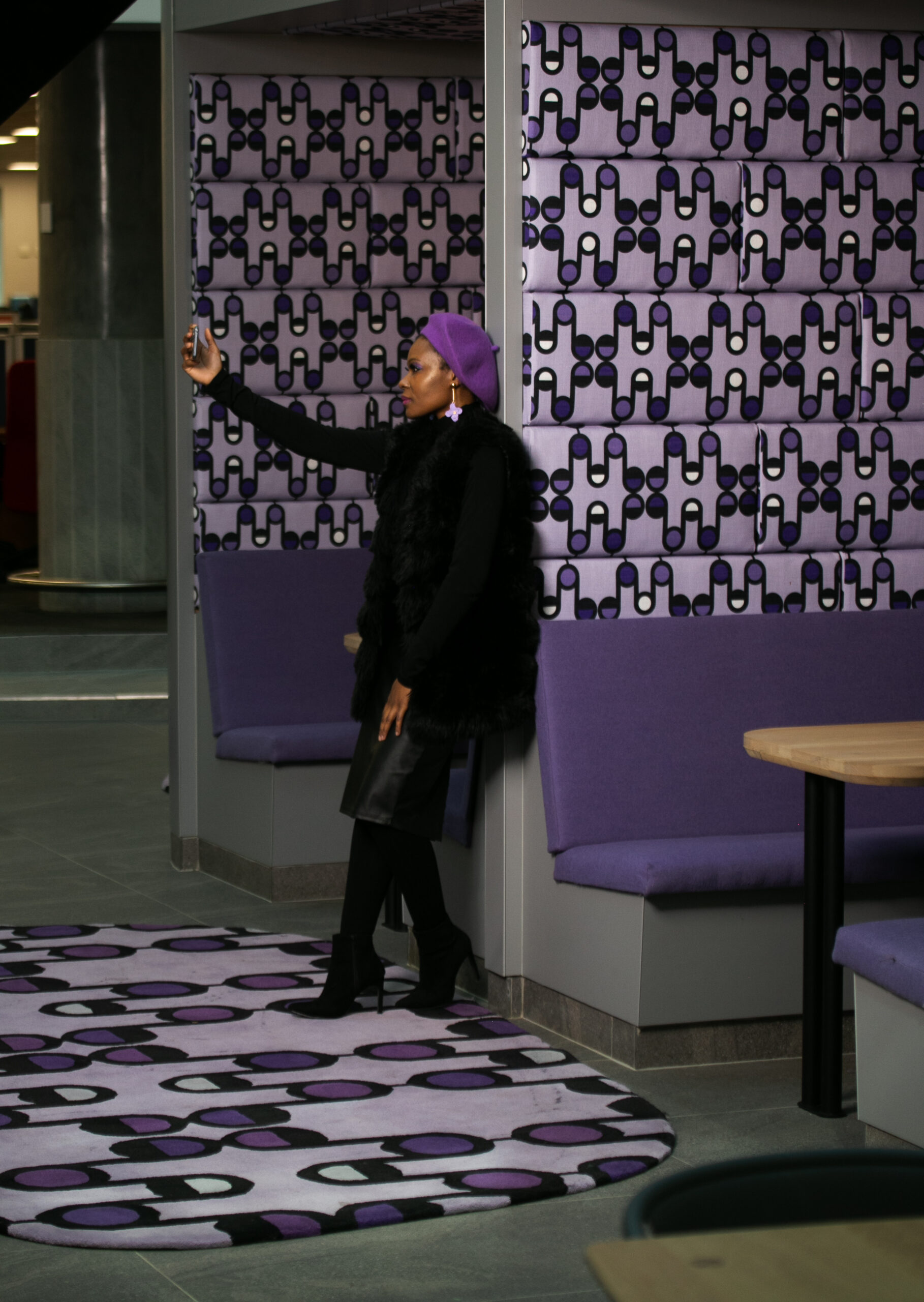
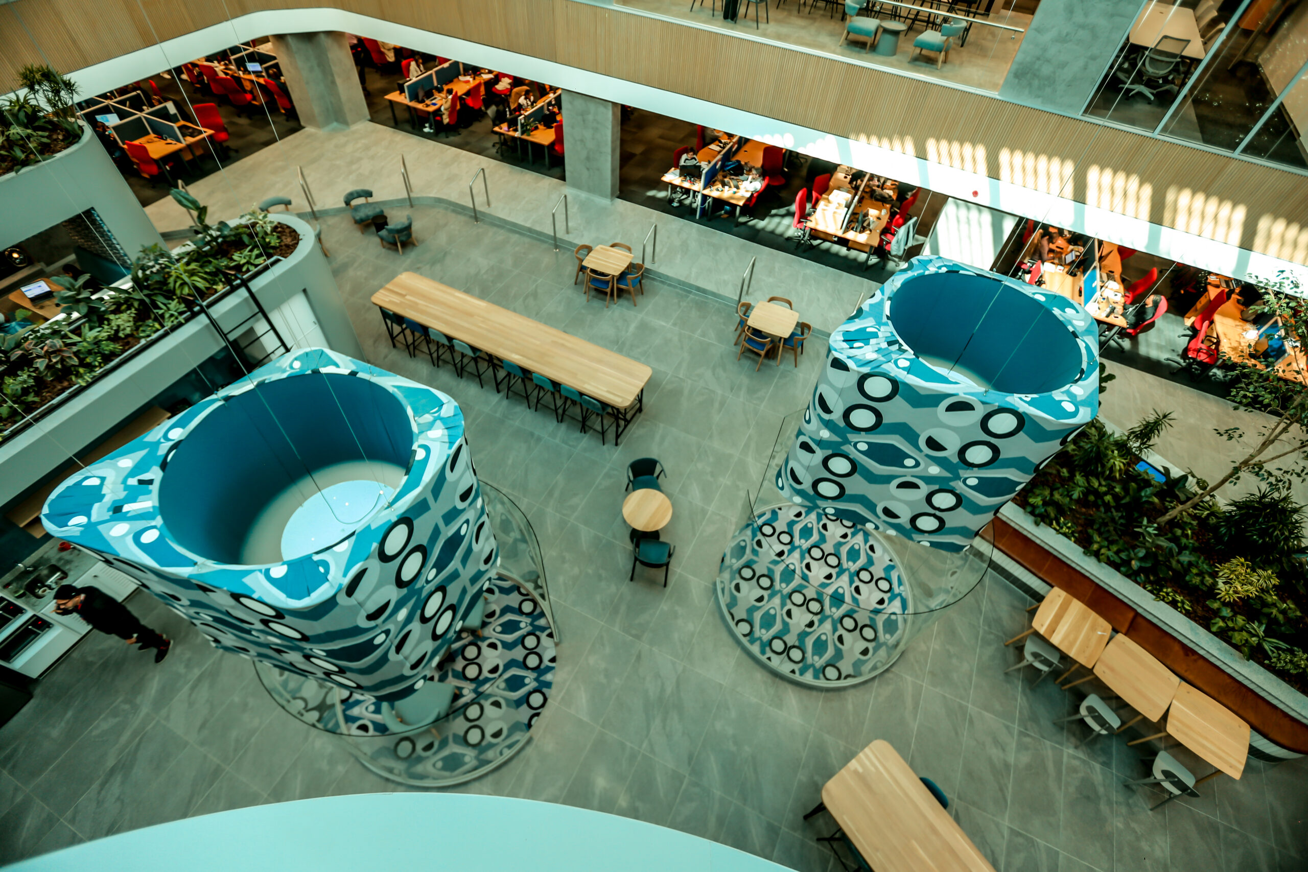
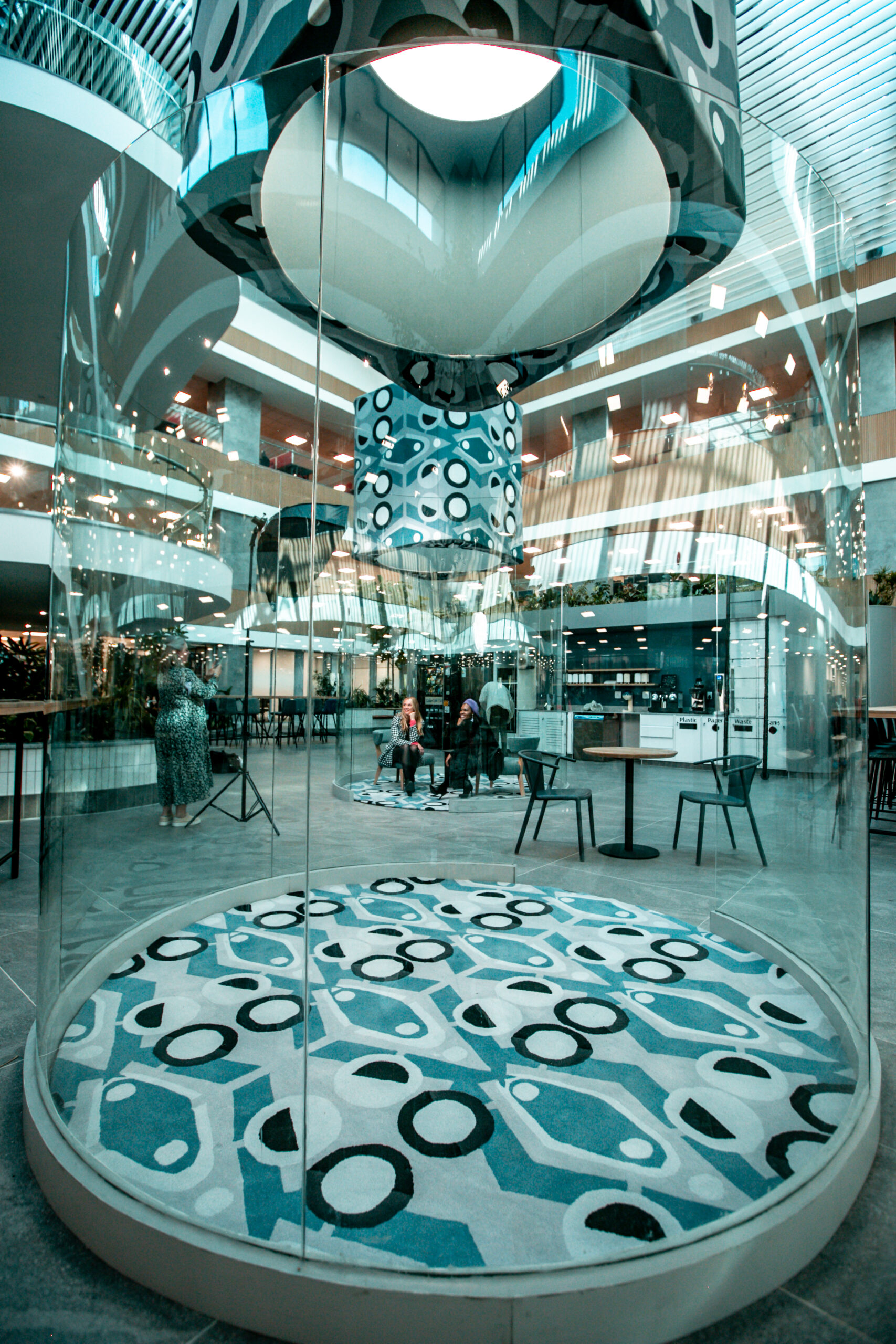
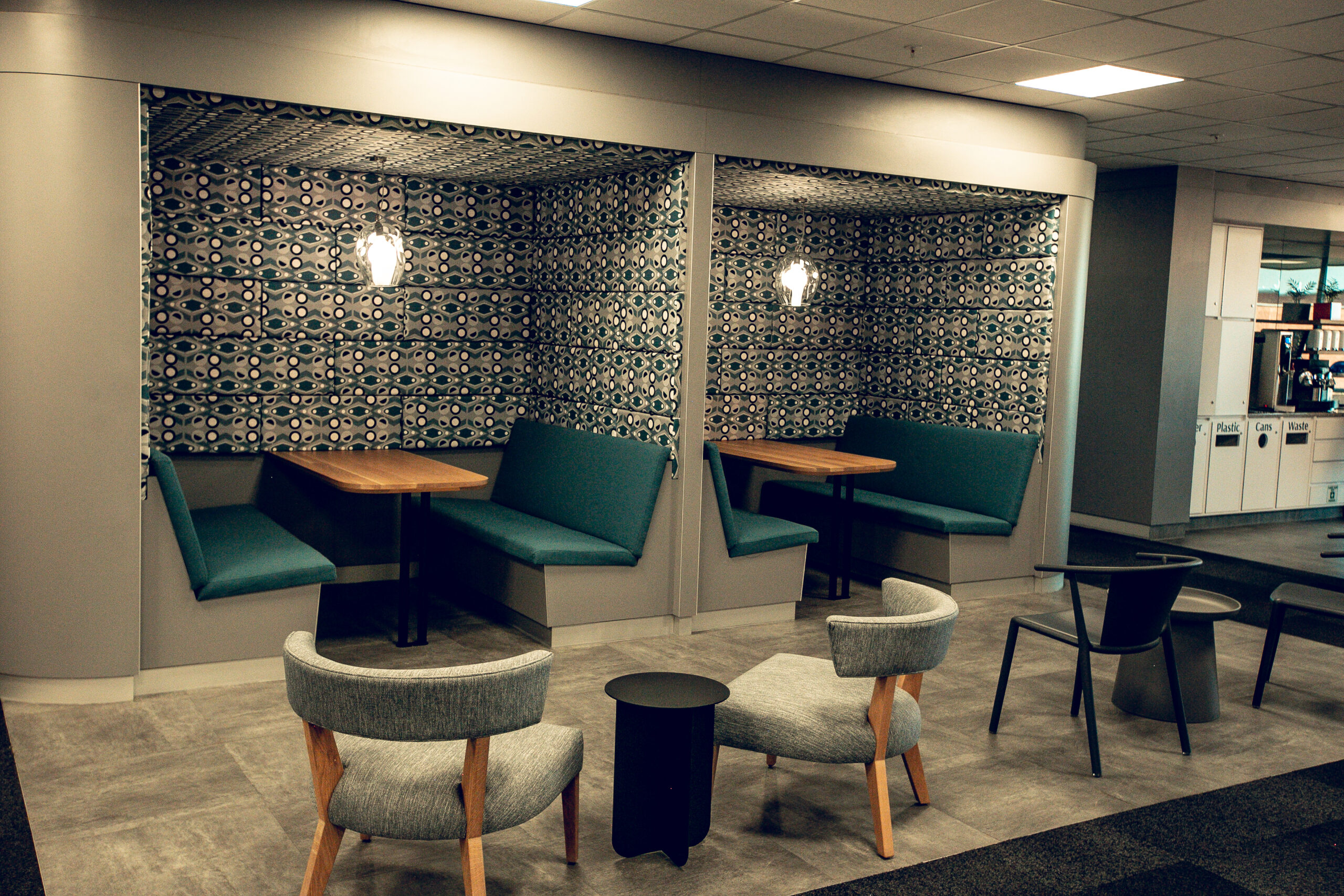
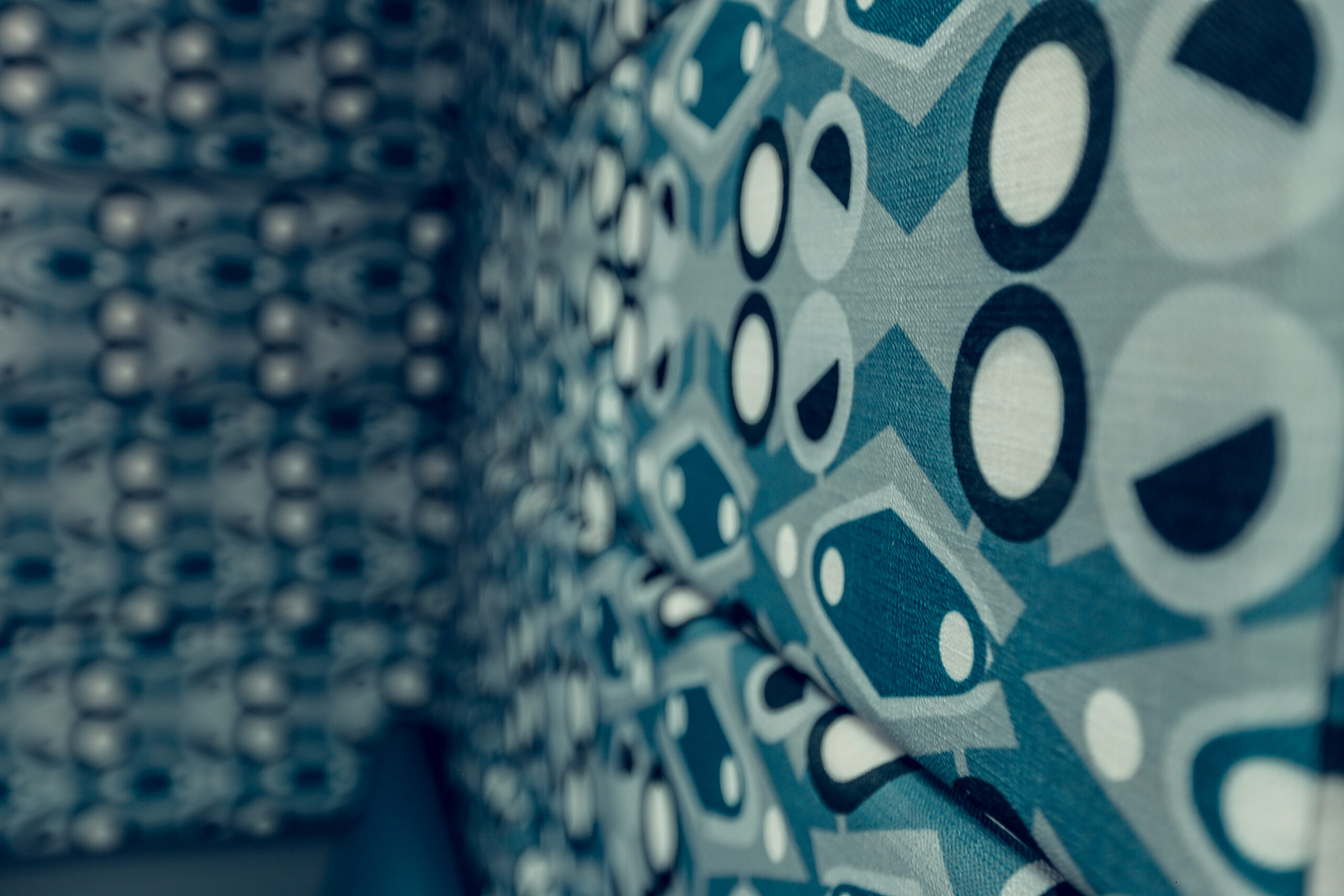
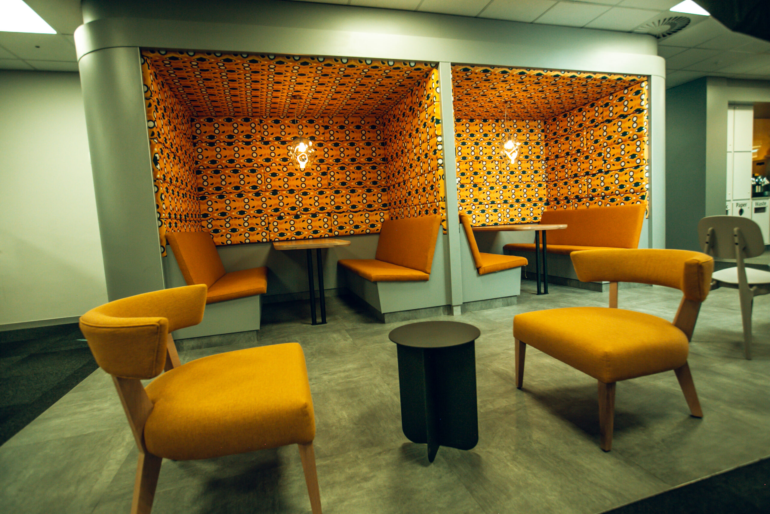
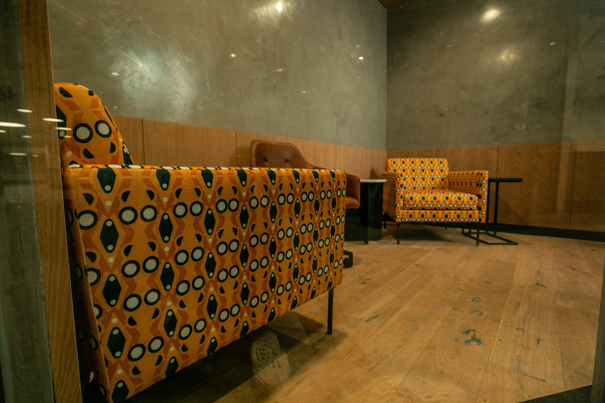
MOMENTUM
Looking at the heart of Momentum Metropolitan, the idea of having a personal interaction with each client contributes towards the longevity of the Brand and the quality of each client’s journey.
The Momentum pattern focuses on the importance of creating a holistic life right from the beginning…The circles signify the centrality of Momentum, as it highlights how the journey can lead you to a fulfilling Life. The wave-like forms in the outlines depict a sense of movement, which shows the shift between our various life seasons.
As their slogan clearly states, “Here for your journey to success” The journey is represented in the curves & wave-like lines reflective of the turbulences experienced in our various paths. These circular solid shapes represent consistency and solidity. of Momentum as a financial institution that encompasses life, security, investment & wellness, resulting in a holistic life. Custom rugs, Upholstery Fabrics, printed and installed by Fabric Bank.
Photo credits _FABRIC BANK & Zac Modirapula
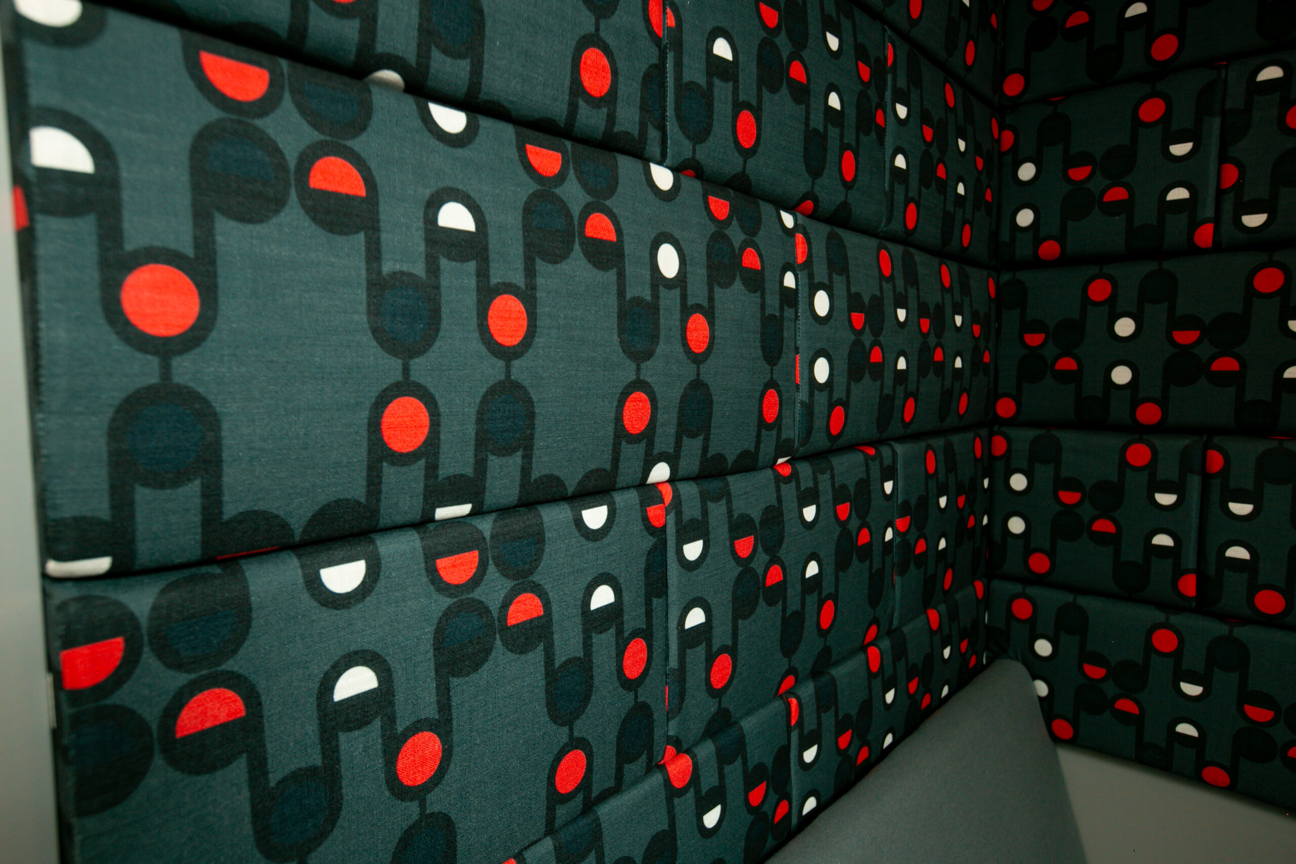
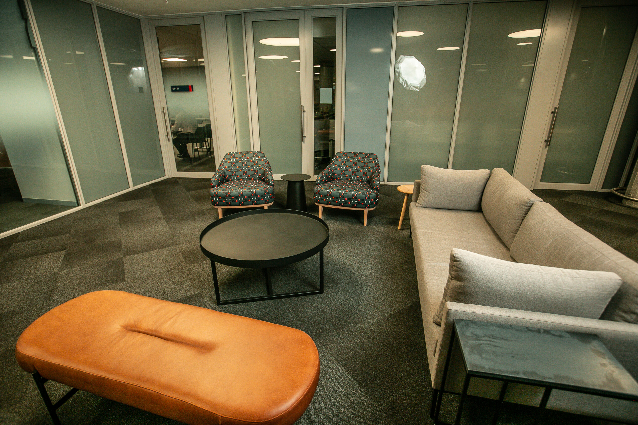
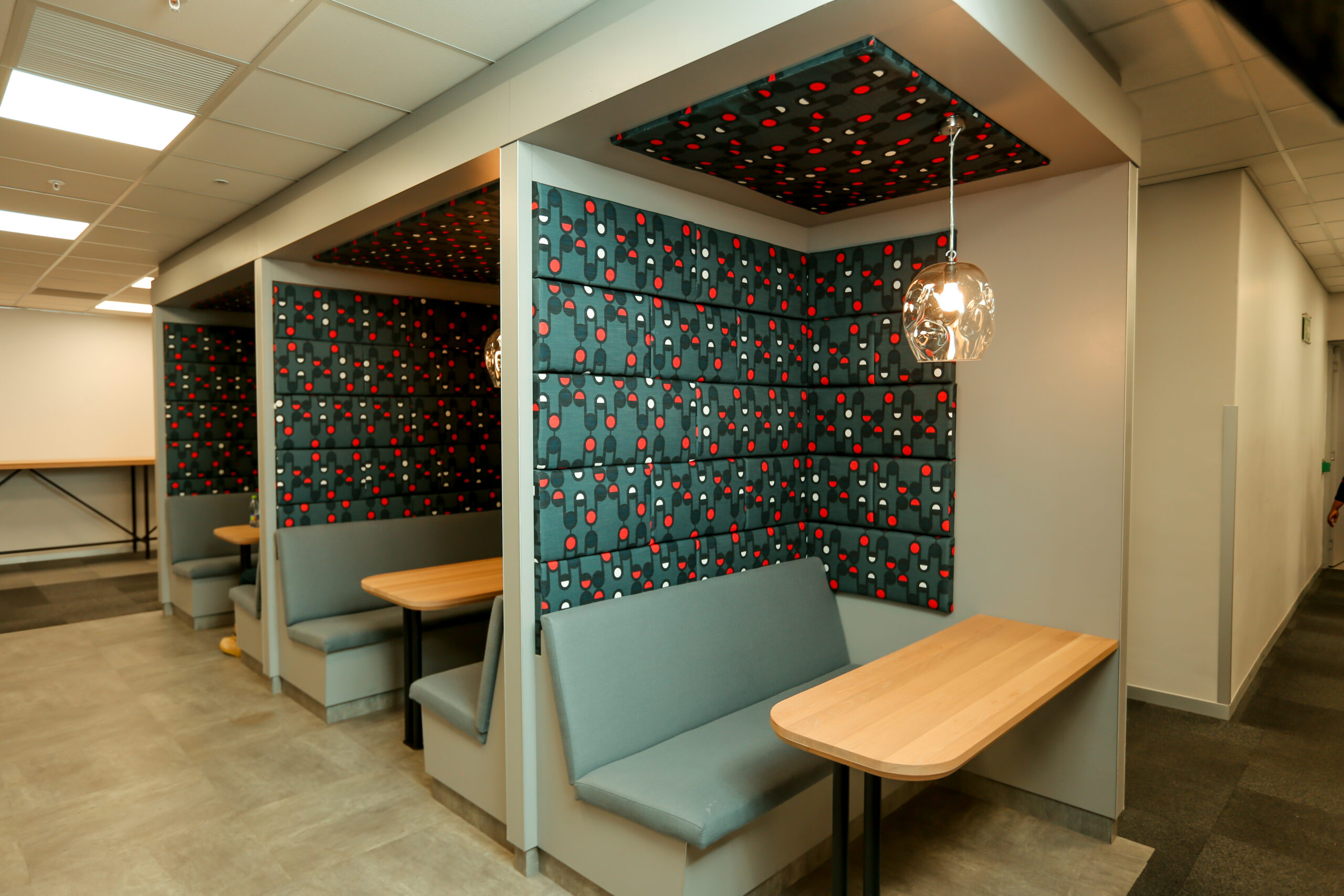
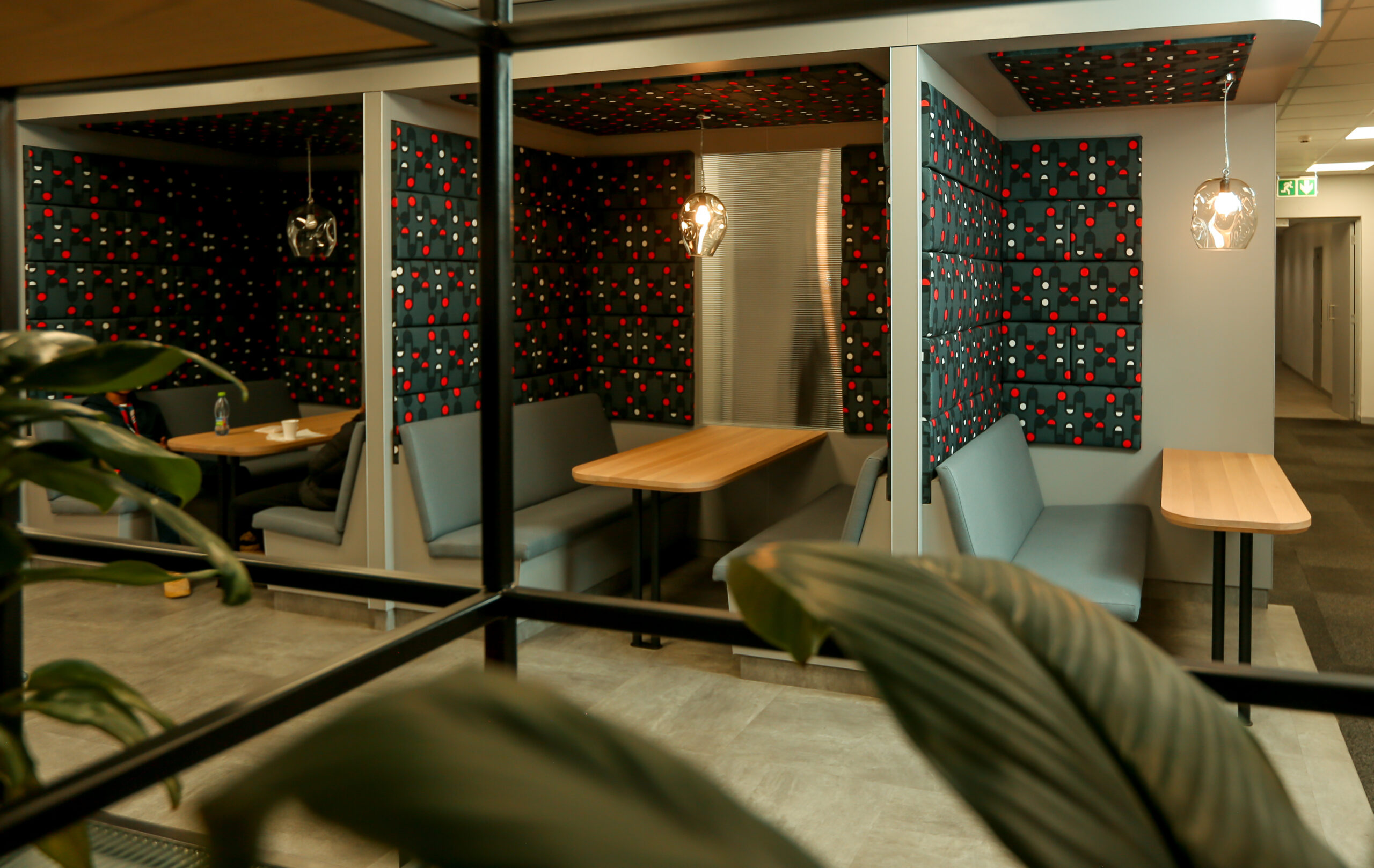
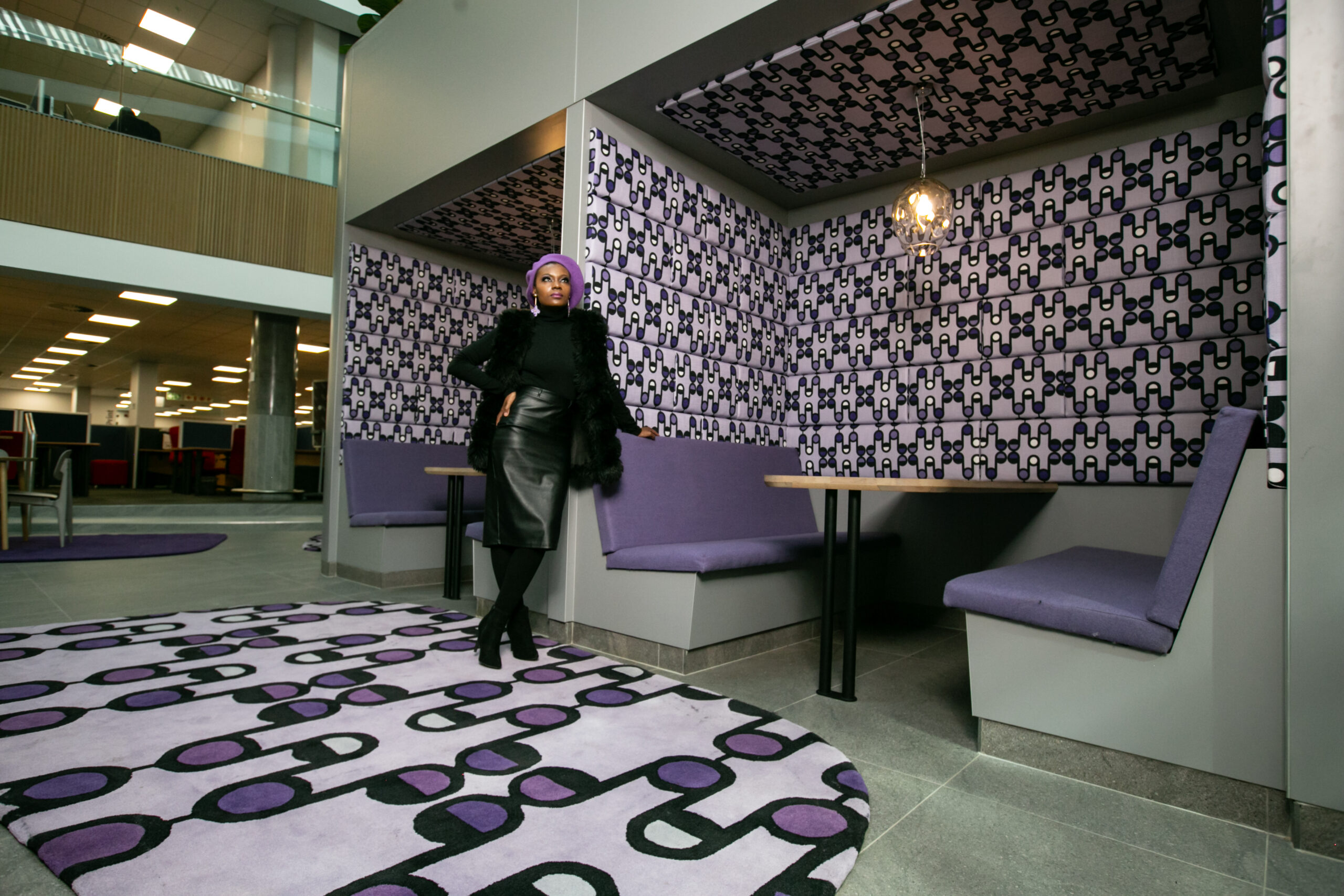
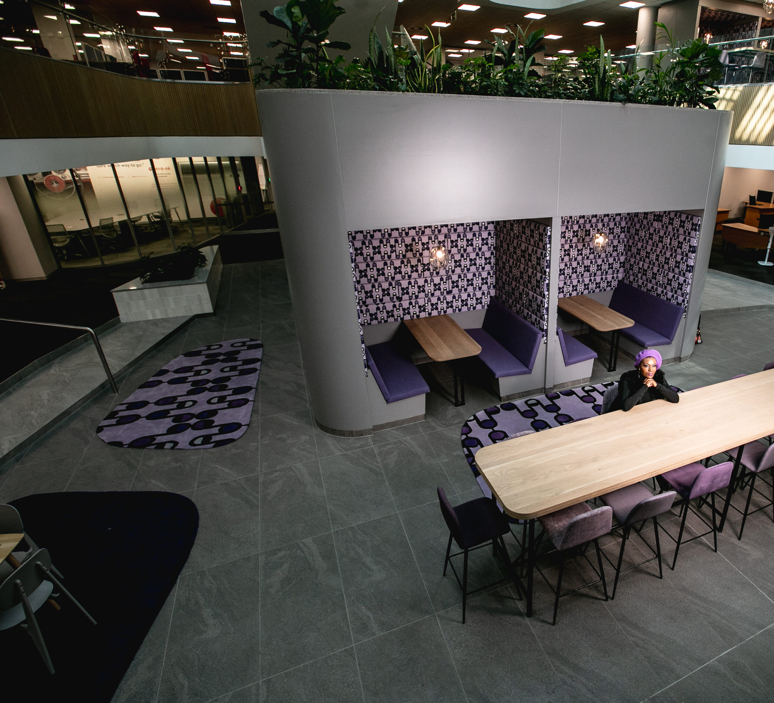
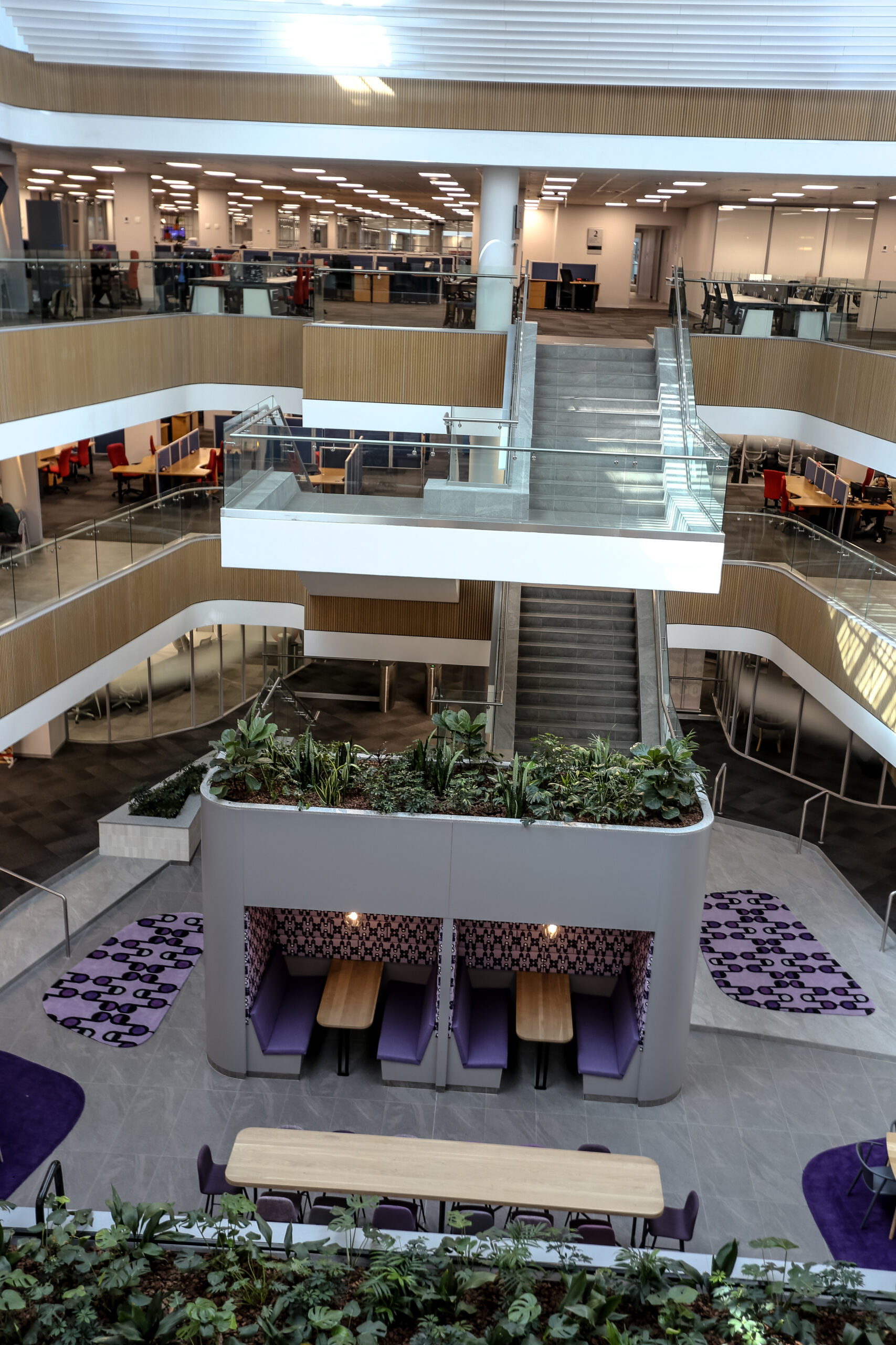
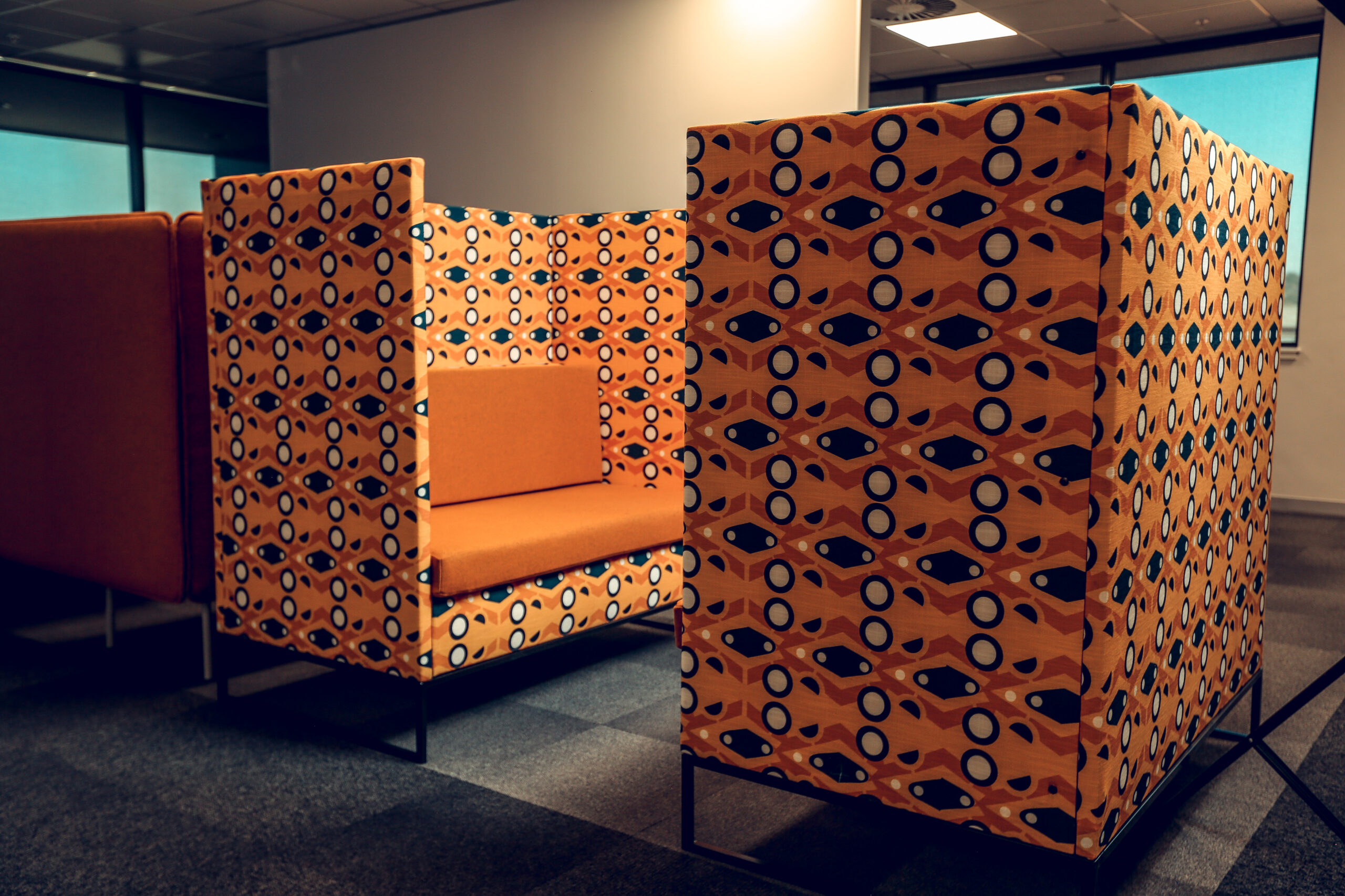
MOMEMTUM METROPLITAN
The Momentum Metropolitan pattern taps into the importance of merging brands.
Their slogan ‘Stronger together’ inspired the idea of creating a pattern which depicts links. These links that encourage growth and unity are represented through the links seen in the half and full circles, which connect to the main diamond shape in the centre. Deliberately blending in some of the lines & circles with the background colour also enhances the pattern and makes it appear more Unified. Upholstery Fabrics printed and installed by Fabric Bank
Photo credits _FABRIC BANK & Zac Modirapula