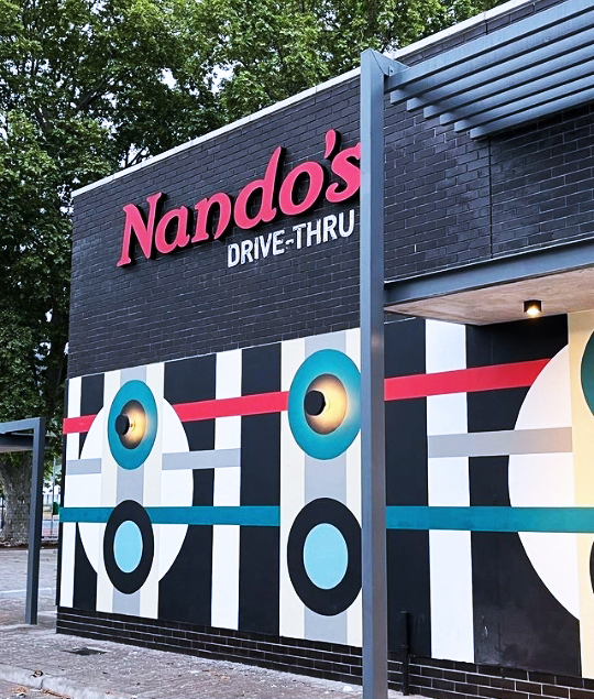
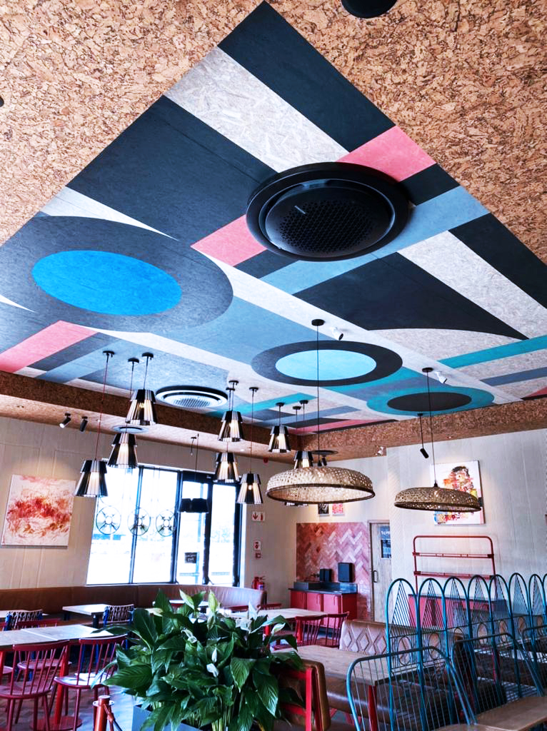
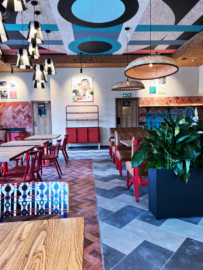
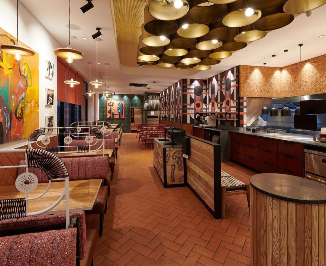
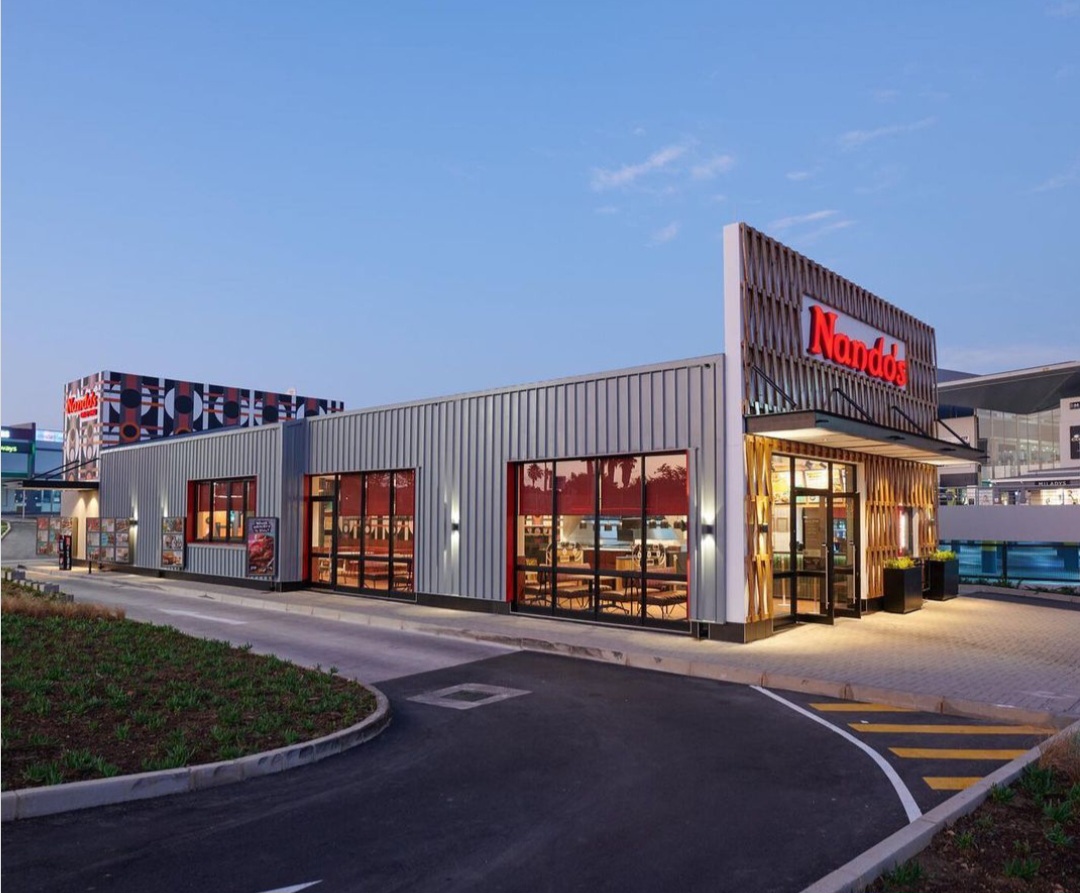
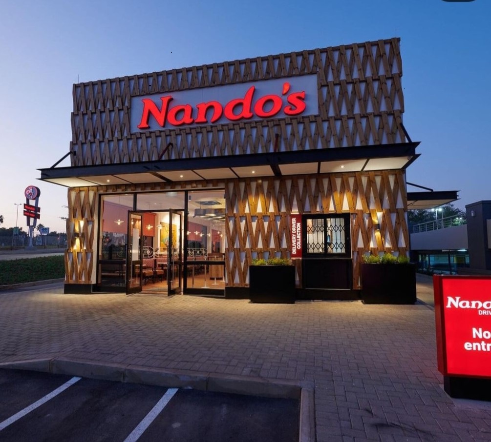
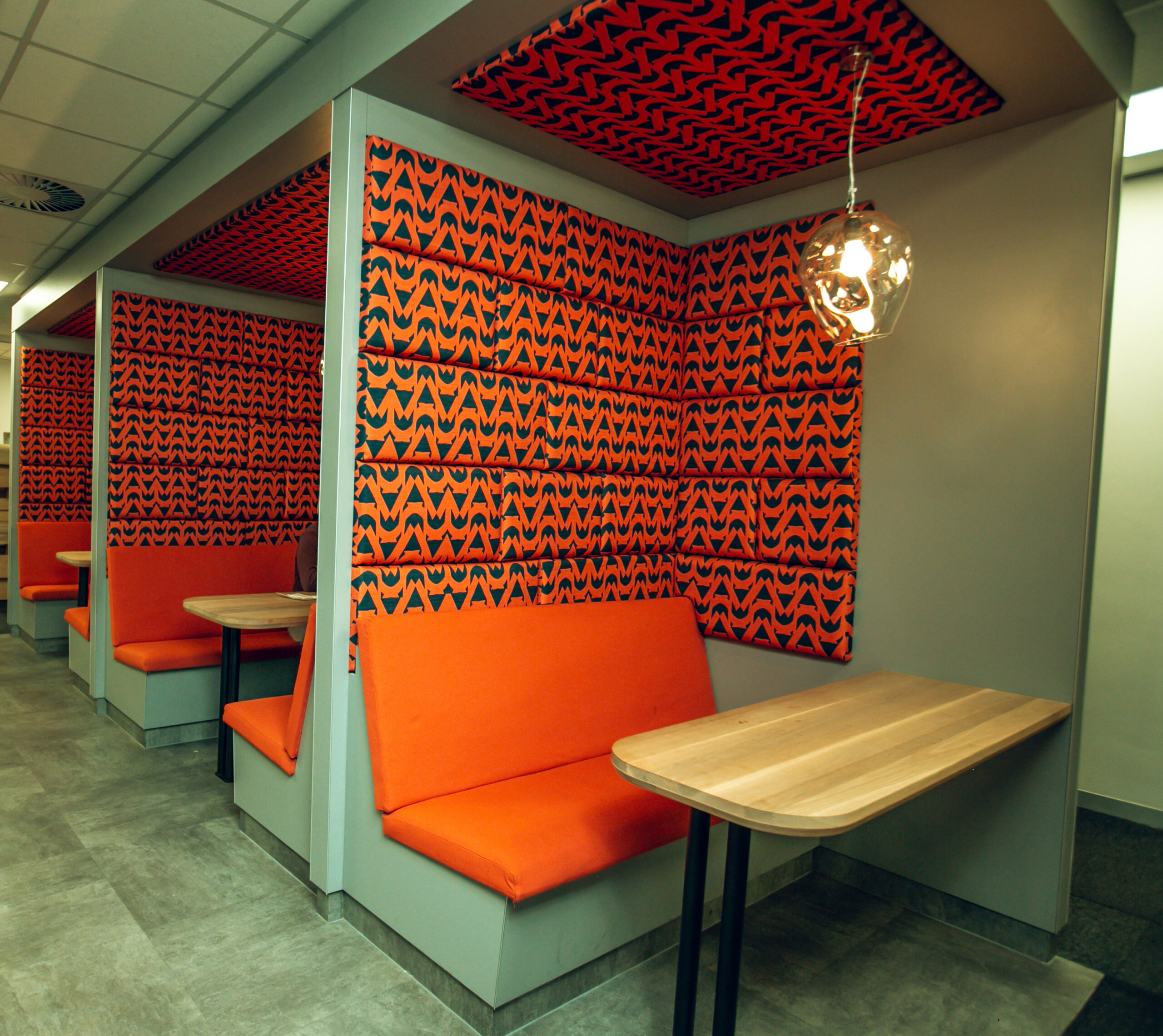
NANDO'S PAARL
This beautiful Nando’s Drive thru in Paarl, Cape Town was designed by Interior Designer Tracy Lee Lynch of Studio Lee Lynch.
The Karo pattern inspired by the traditional face paint of the Karo people from Ethiopia, is an expression of modern African art translated into a modern Afrocentric aesthetic for a modern interior space. The application of the pattern took on a bolder canvas, wrapped around the exterior of the Nando’s restaurant. The print further introduced into the interior space and applied to the ceiling, which heightened the experience of the look & feel. Of course, what goes up must come down…The application was carried through and printed on the chair backs to complete and unify the design. Taking an Ethiopian Tribe and fusing modern design to converse in a South African Portuguese space…is proof that cross-cultural interiors are explosive.
Photo credits _Studio LeeLynch
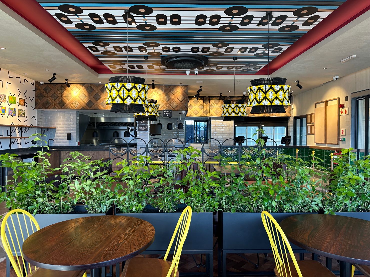
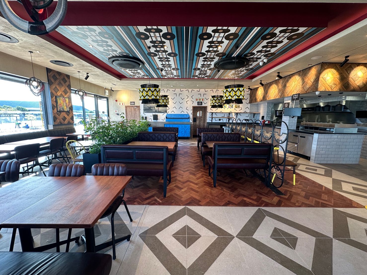
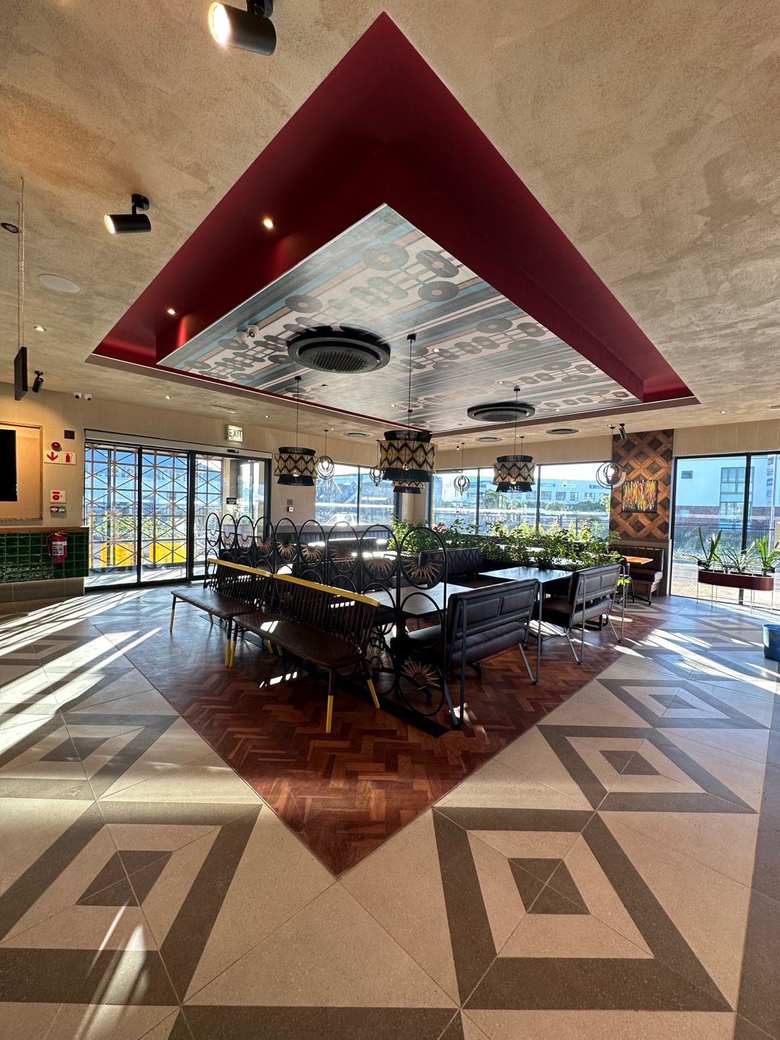
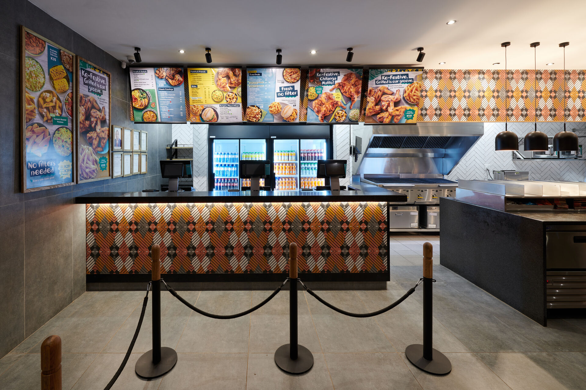
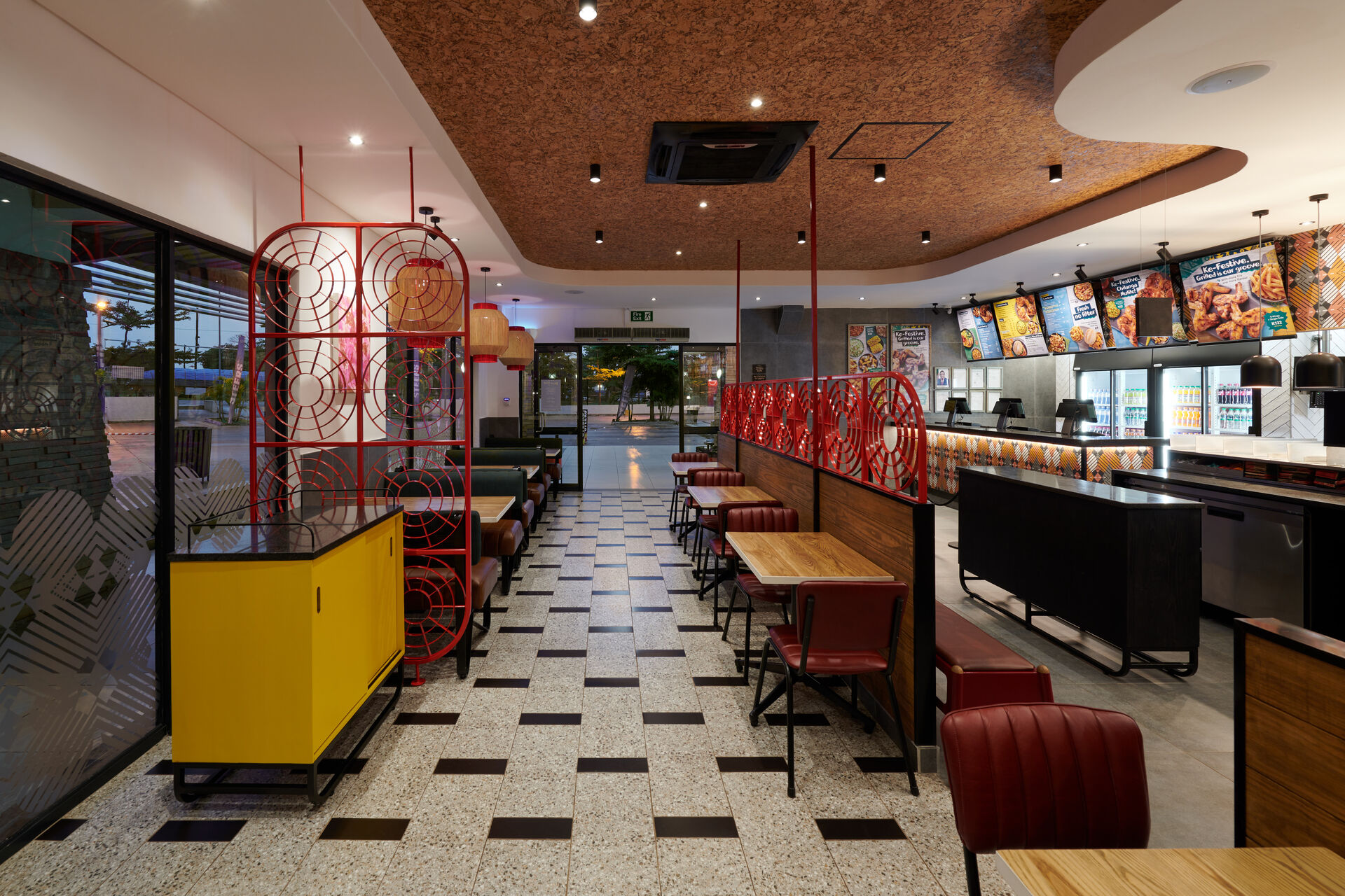
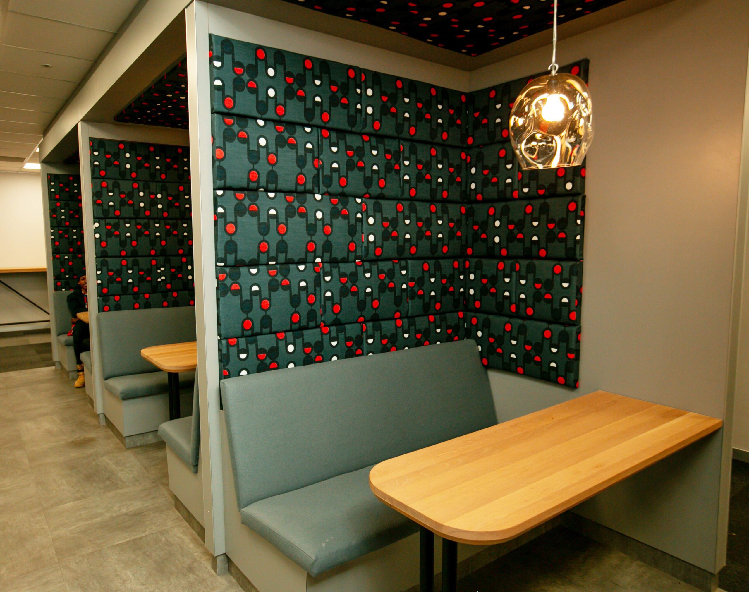
NANDO'S NORTH RAND ROAD
This beautiful Nando’s Casa in North Rand Road was designed by Pretoria-based design company Reddeco and features the Queen Makoba pattern. The pattern forms part of a collection that celebrates a lineage of Rain Queens from Ga-Modjadji. Queen Makoba was one of the Rain Queens who once ruled. This pattern, consisting of lines between circles and ovals, reiterates the power of interconnection between nature and humans. Furthermore, the vertical lines mimic the direction in which the Rain falls from the sky to the ground.
The rich colourway, which is a combination of maroons, muted yellows & reds accompanied by greys and extreme neutrals, was customised as requested by Reddeco, hand-painted to complement the vertical timber slats on the façade. The colours also complement the maroon leather seating and the red, white, and black pendant lights. This stunning application was also printed onto timber to create a feature ceiling bulkhead.
Photo credits _REDDECO
NANDO'S WOODHILL
Location: Woodhill, Pretoria, South Africa
Pattern: Karo Pattern
Design: REDDECO
Inspired by: The dotted indigenous face paint of the Karo Tribe of Ethiopia
Application: Exterior wall wrapping, interior walls.
Photo credits _REDDECO
NANDO'S WATERGATE
Location: Philippi, Cape Town, South Africa
Pattern: Queen Makobo Modjadji
Design: PROPORTION
Inspired by: Queen Makobo Modjadji was the 6th Rain Queen of the Balobedu tribe.
Application: Ceiling
Photo credits _PROPORTION
NANDO'S CHINGOLA ZAMBIA
Location: Chingola, Zambia
Pattern: Kikuyu Pattern
Design: REDDECO
Inspired by: The cultural face paintings of the Kikuyu Tribe of Kenya
Application: Surface – counters, walls, frosted glass.
Photo credits _REDDECO
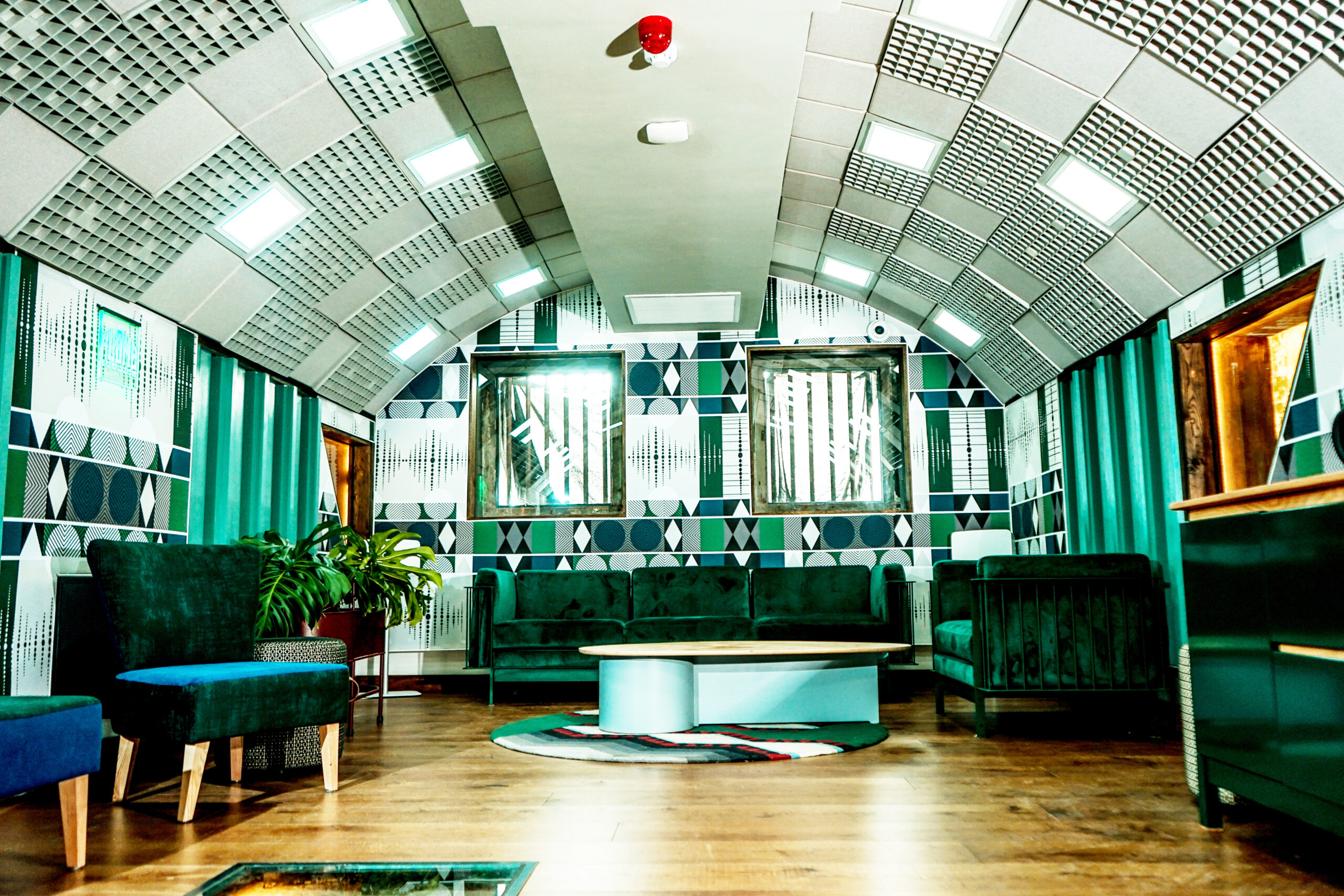
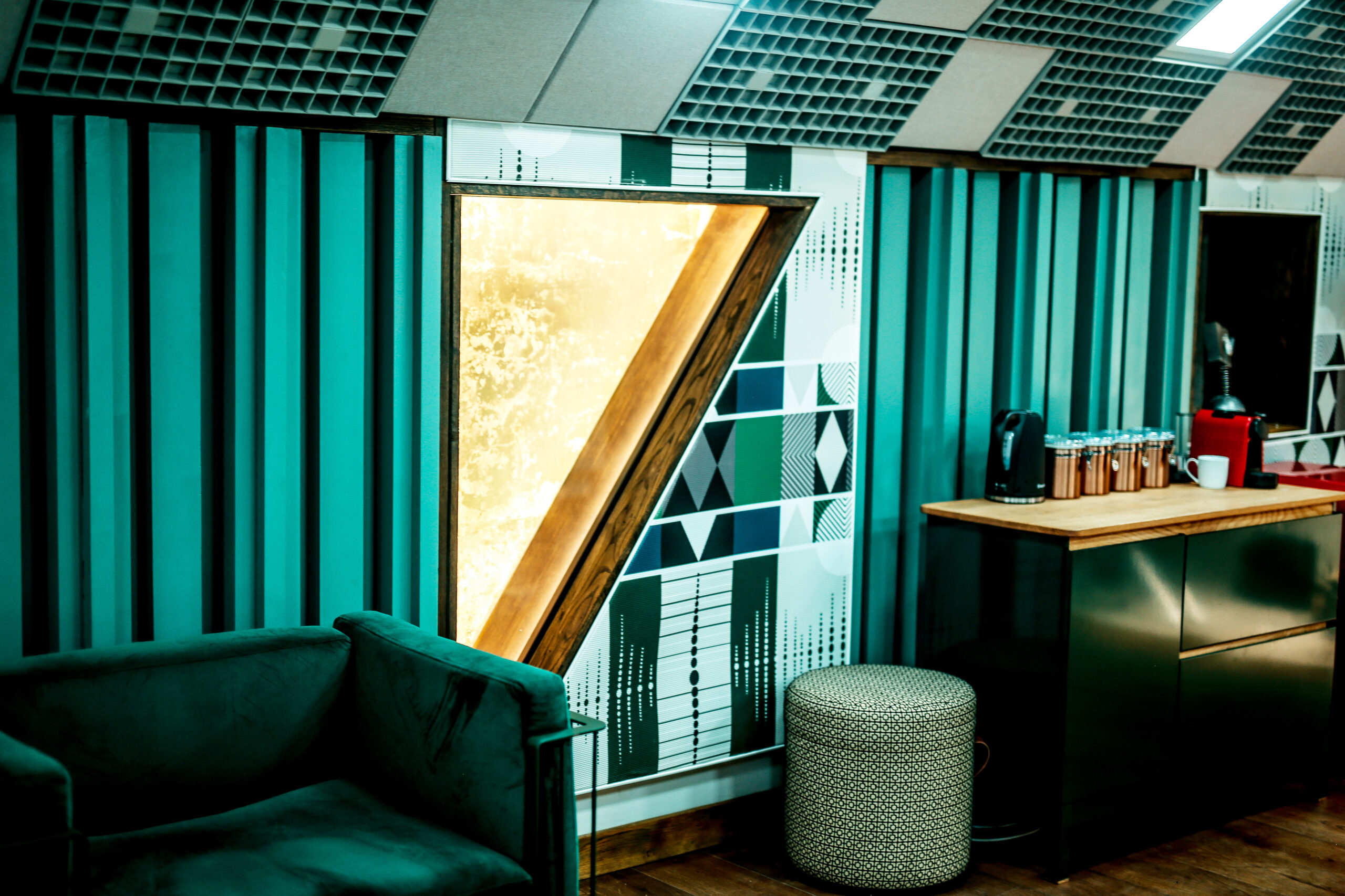
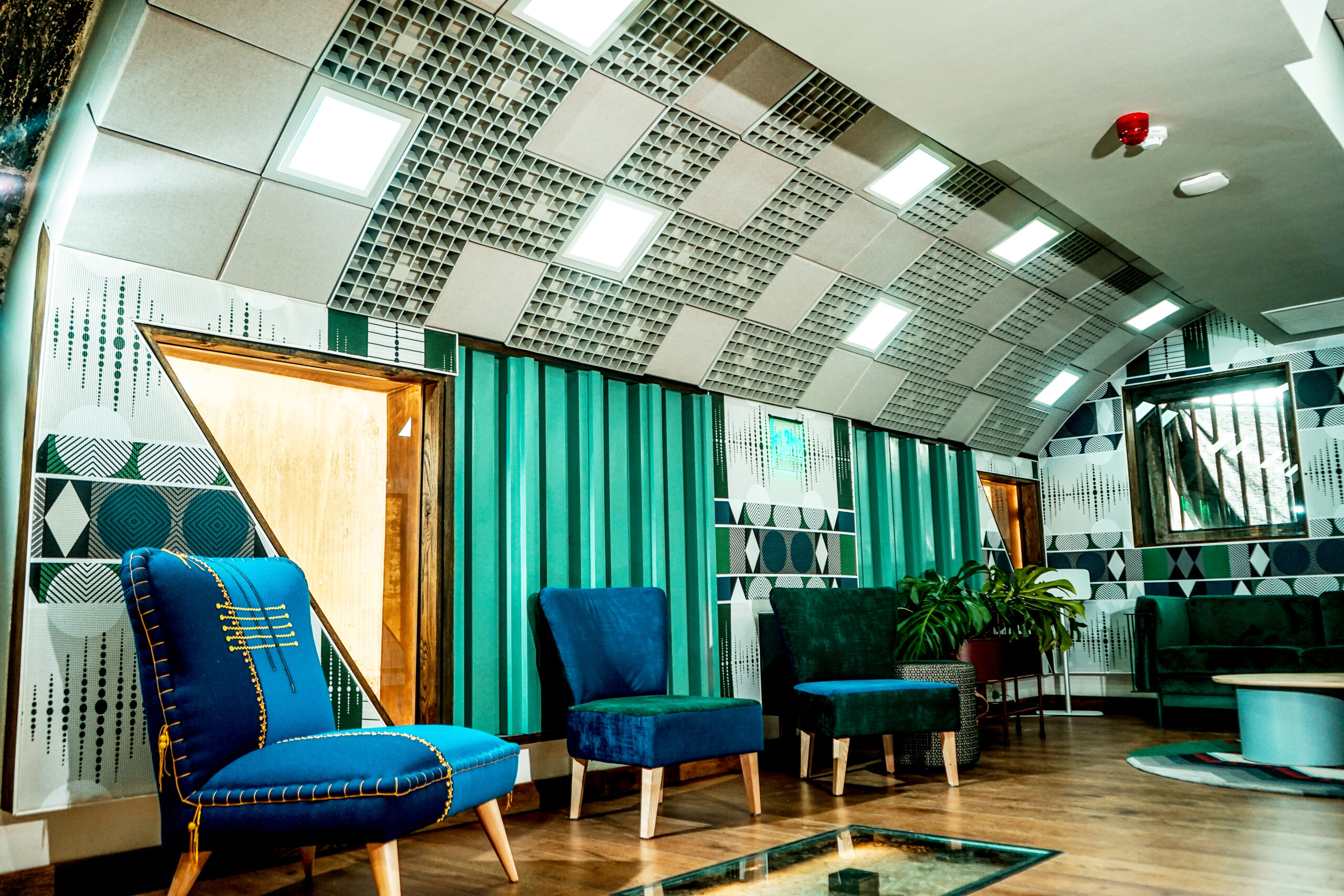
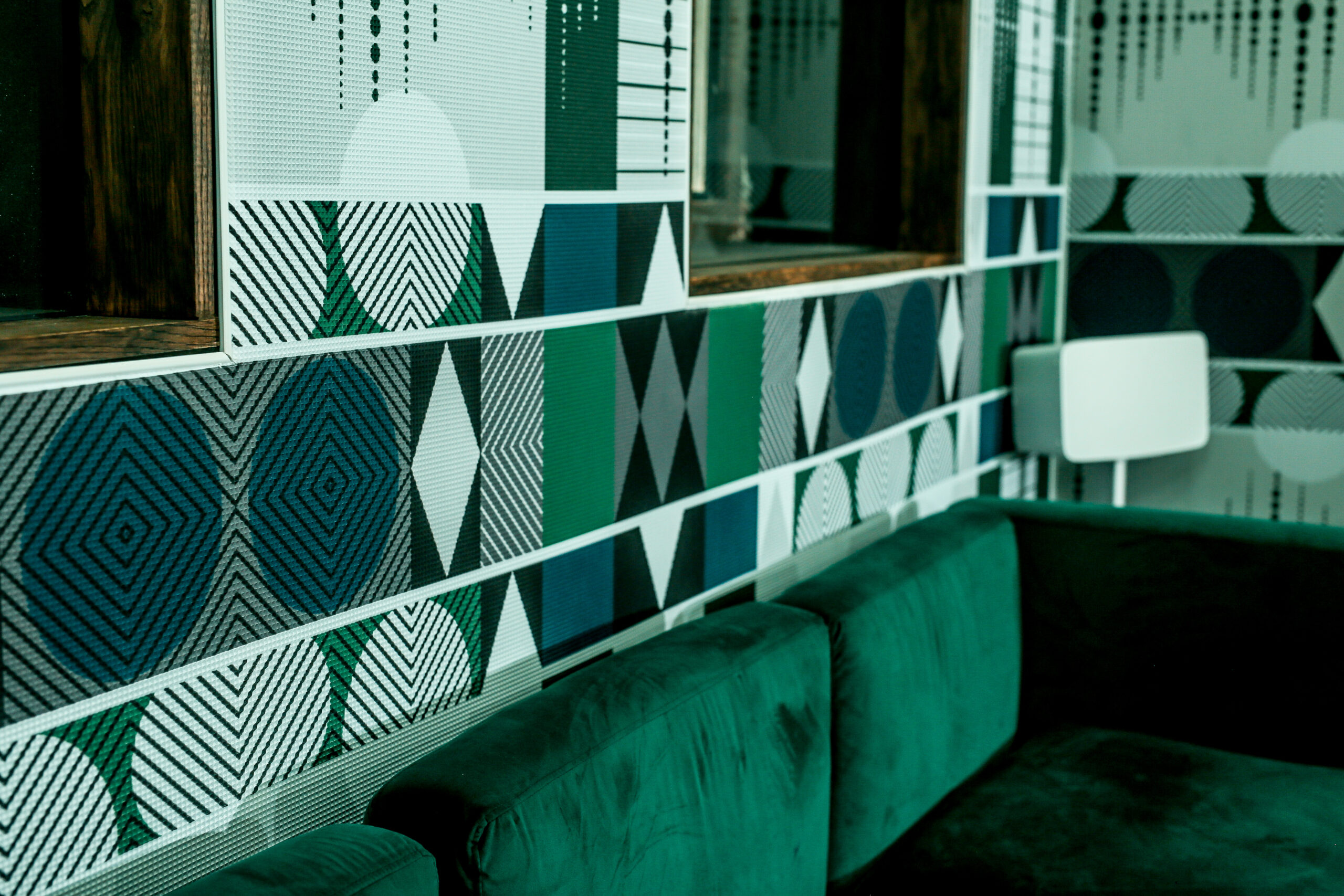
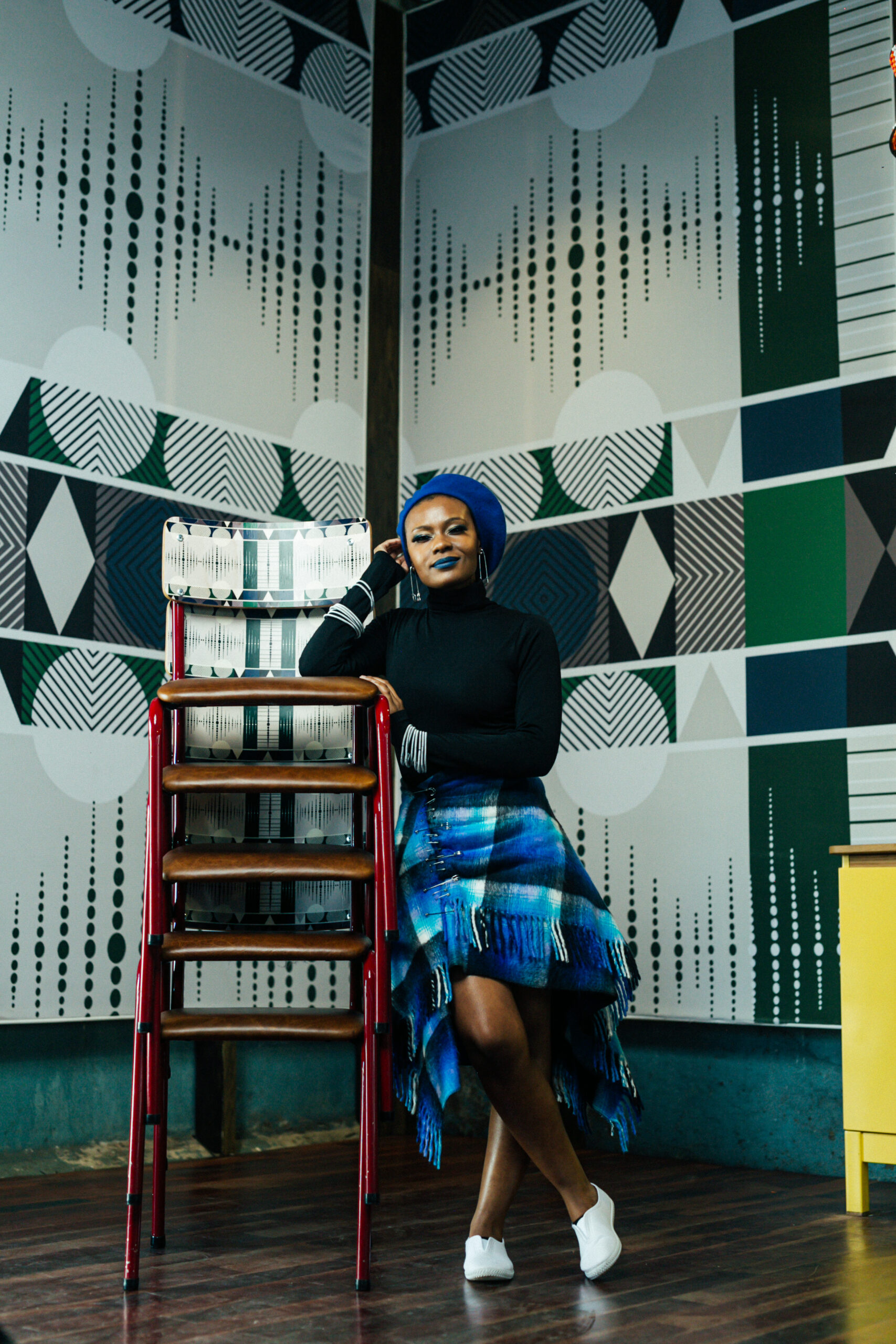
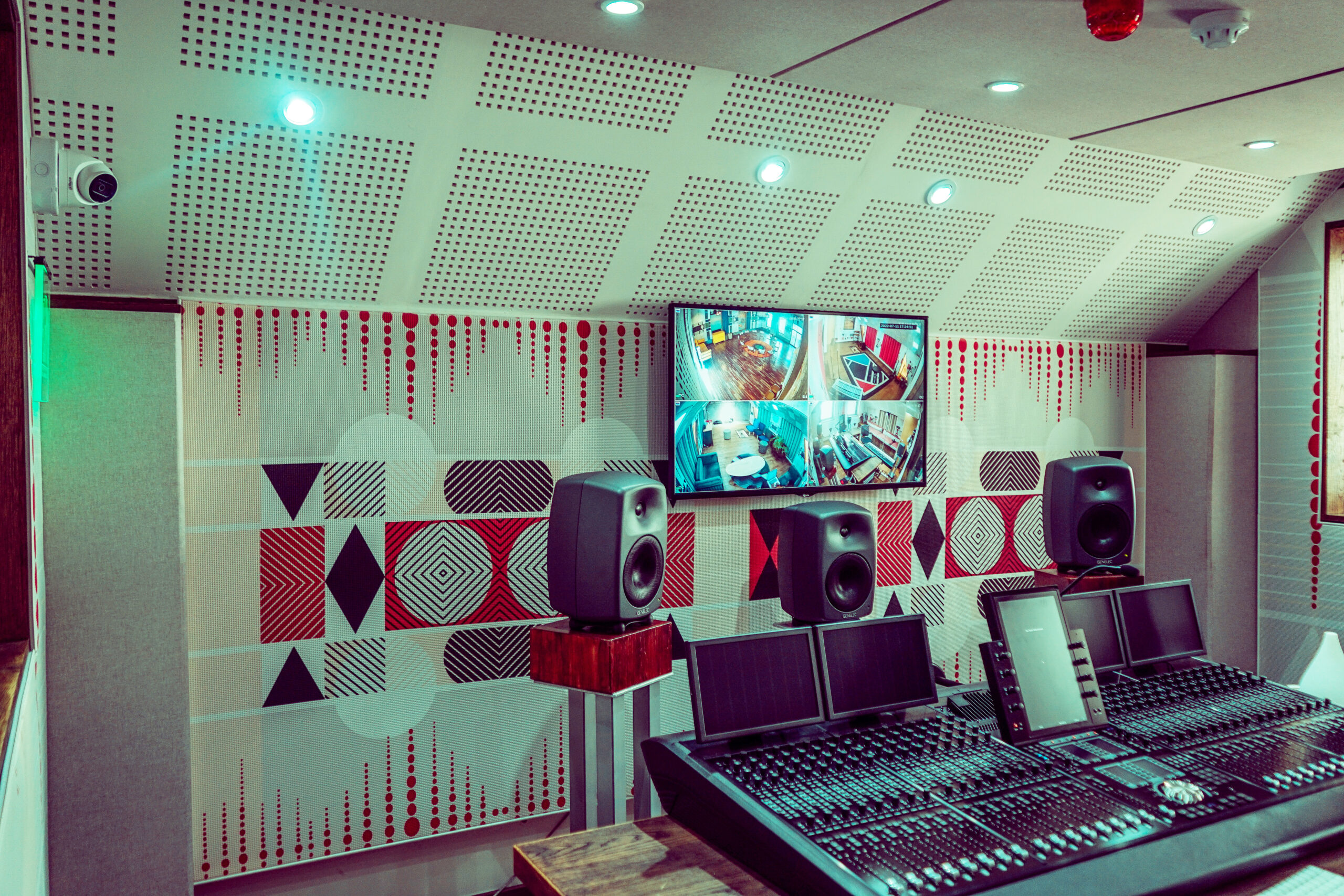
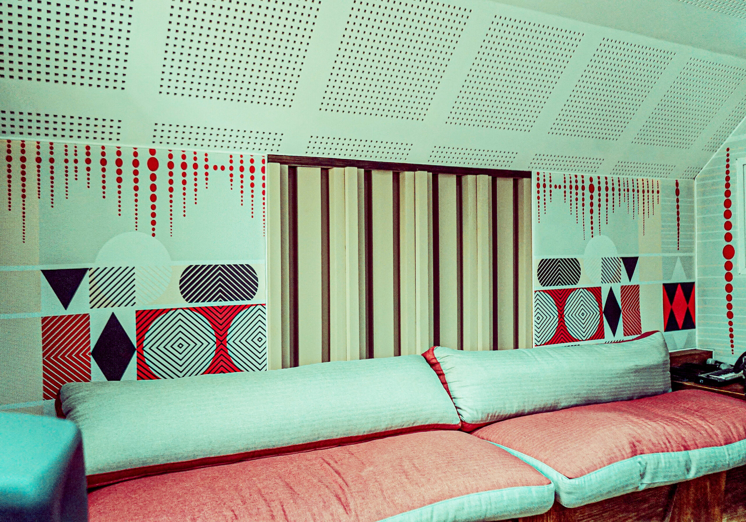
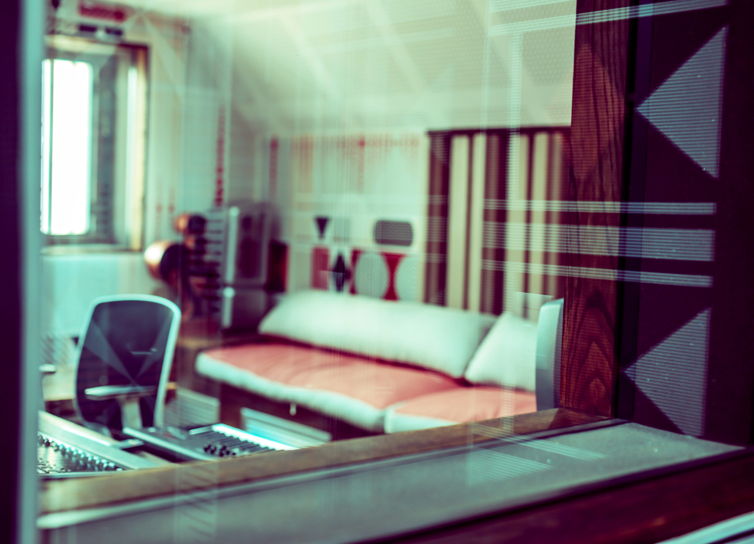
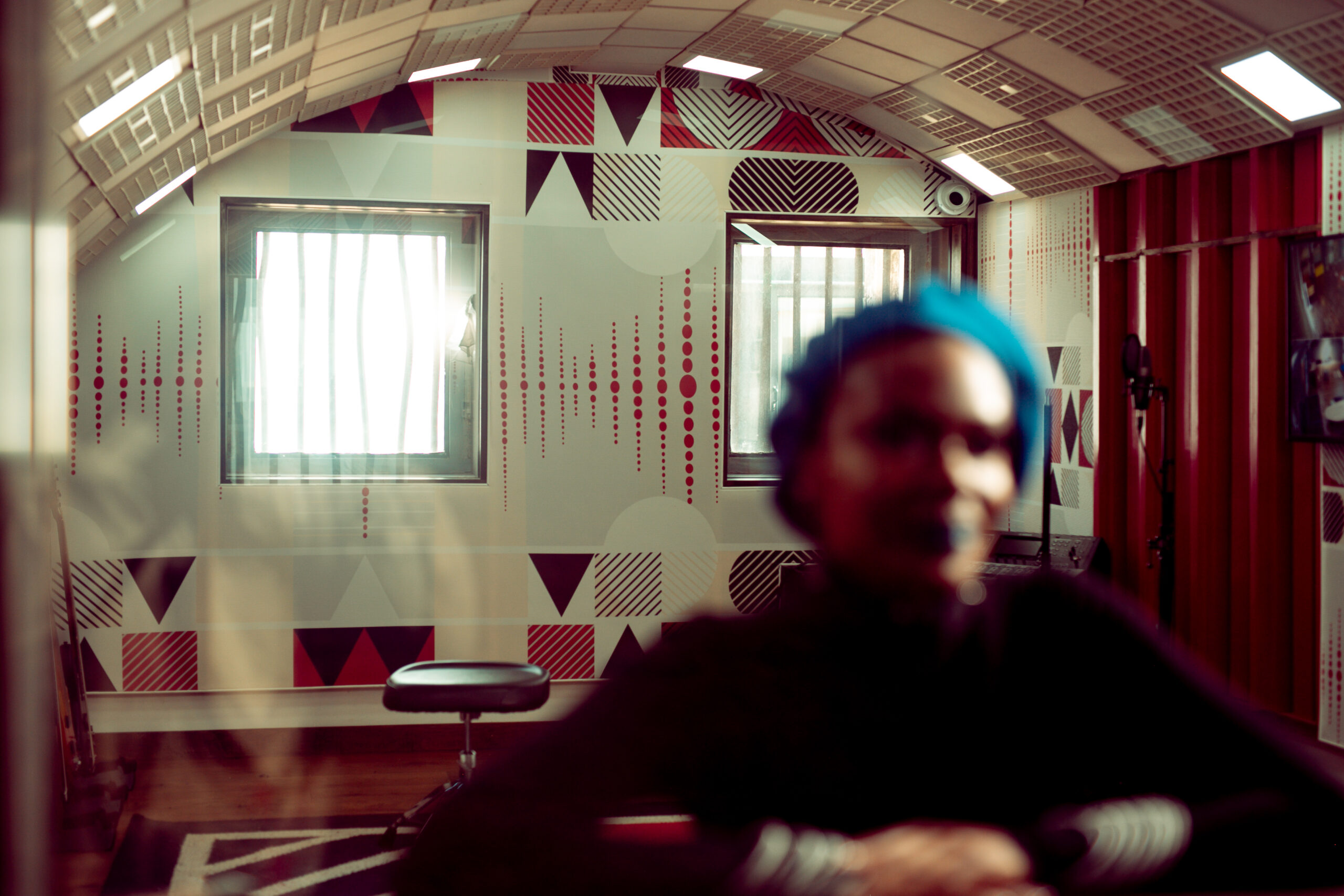
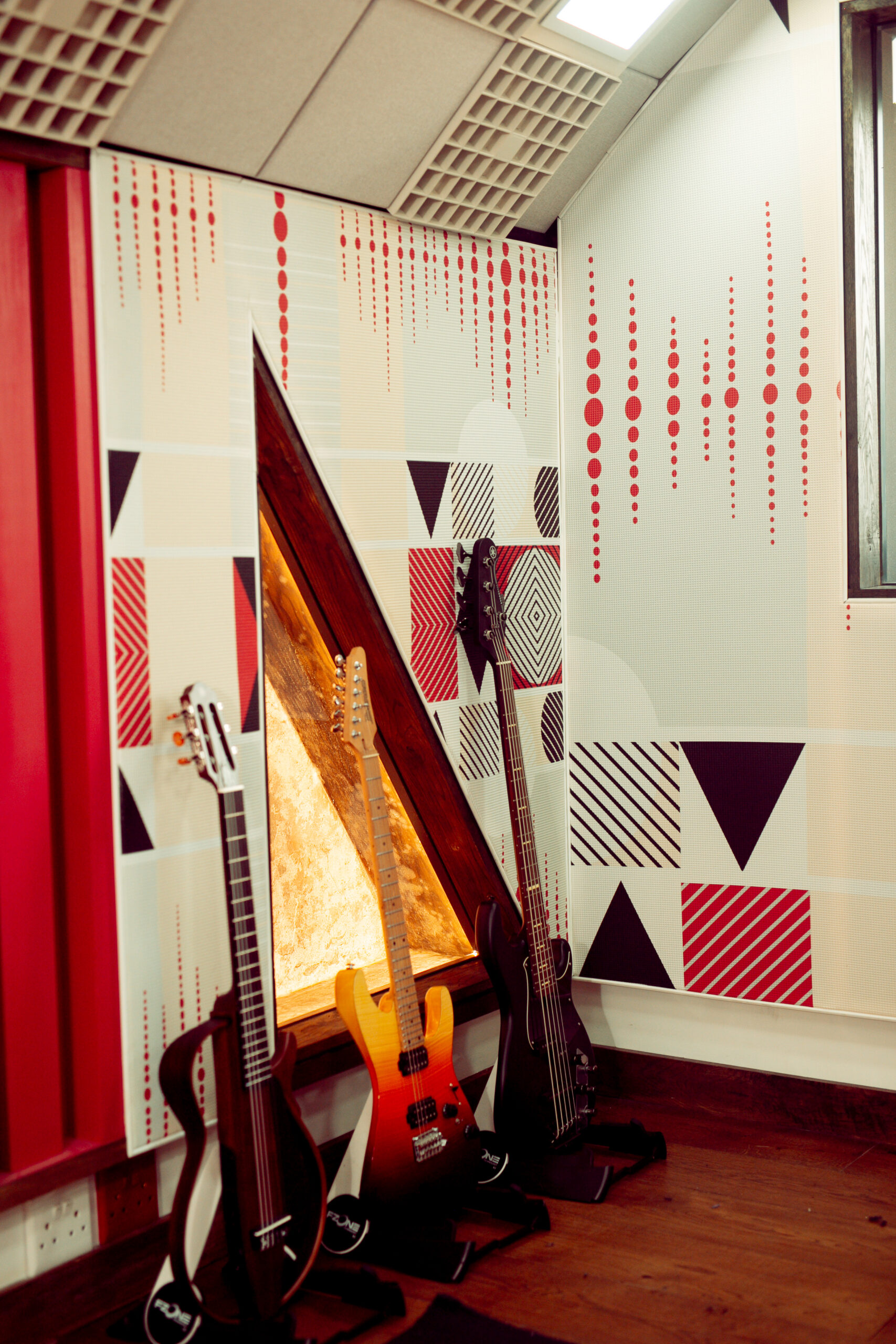
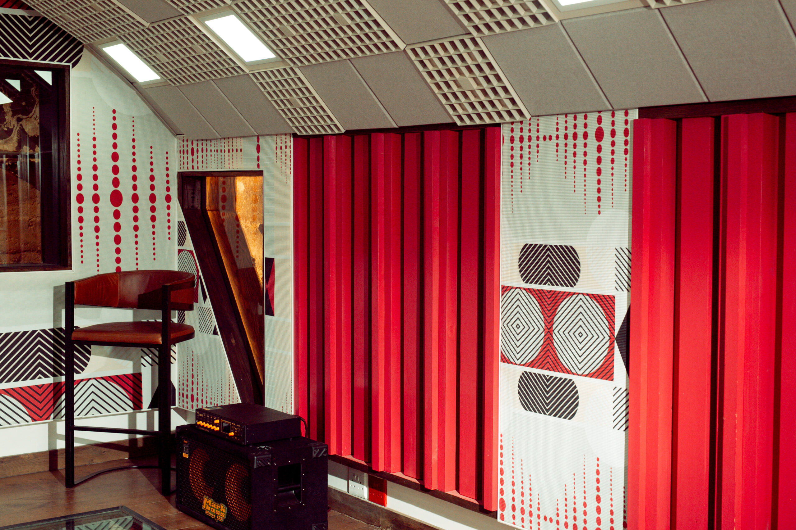
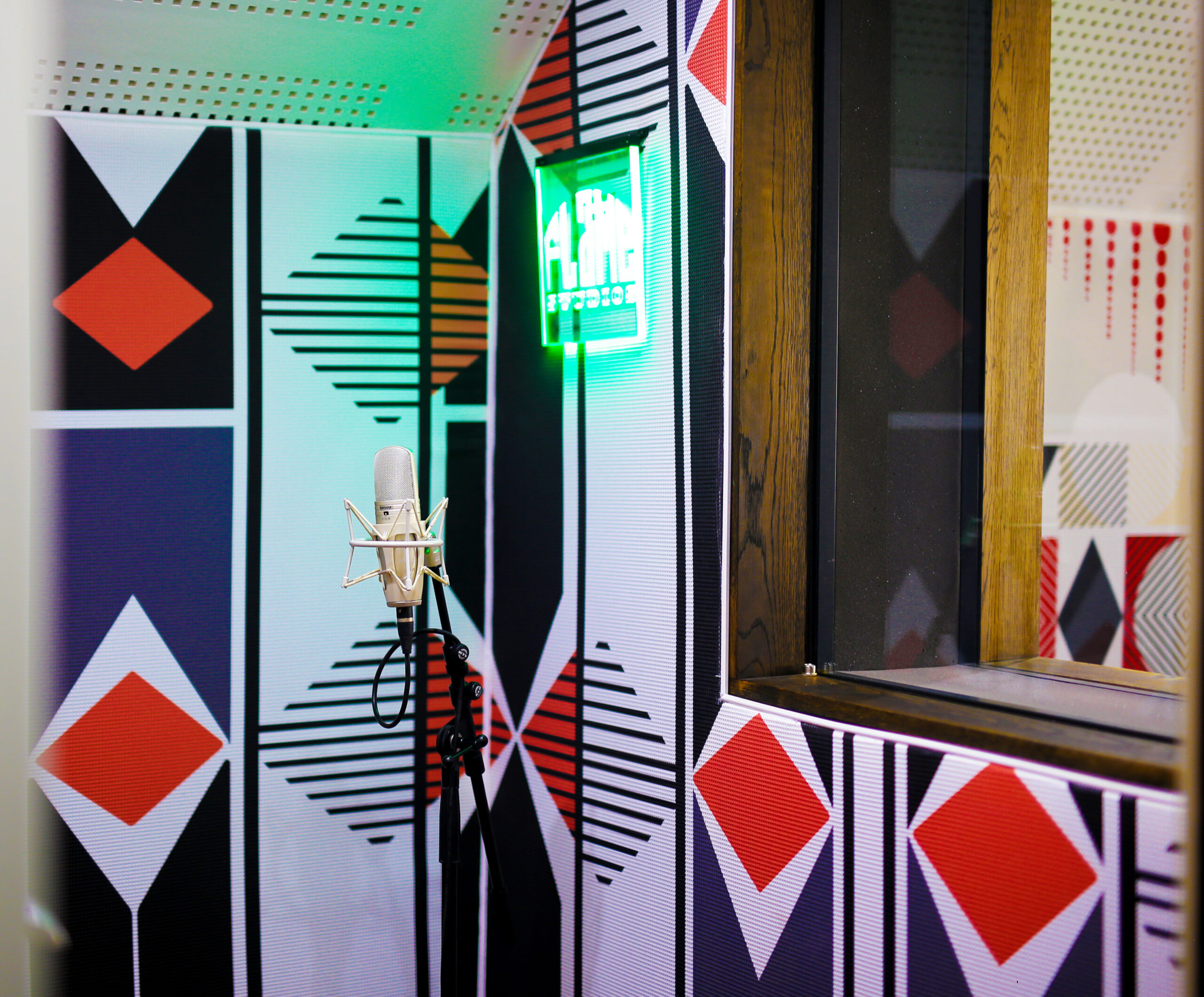
FLAME STUDIOS
Frequency is the number of vibrations which pass through sound waves in a particular period of time. The Frequency pattern was inspired by this instantaneous action, which occurs when sound moves within these many sound waves.
The Flames Studio is a one-of-a-kind musical space designed by Interior designer Tracy Lee Lynch of Studio Lee-Lynch. It is home to a thriving arts community located at the historic site at Constitutional Hill, home to notorious Fort, where both Nelson Mandela and Gandhi were imprisoned and now home to the highest court in the land – the Constitutional Court.
The various geometrical shapes represent South Africa’s multi-layered heritage and our love for the African aesthetic. Lines and circles are repeated to emphasise the sound waves, which are invisible but can be felt through the energy which the music and people bring to the space. Pattern application on Acoustics and wallpaper was printed and installed by Robin Sprong Wallpapers.
Photo credits _ Zac Modirapula
TRACE HEAD OFFICE
The Trace office wallpaper design and installation was a collaborative project with ‘What we Cherish’ and the founder Melaney Oldenhof. It is an online store which aims to support women of colour in design and focuses on sustainability and preservation.
The Yacouba pattern was inspired by the Yacouba or the Dan People. They settled in the Ivory Coast but they had originally migrated from Sudan, Mali and Guinea.
They believe in one supreme God and that there is a spirit which acts as a mediator between God and his people. As strong believers of reincarnation, their amazing traditional face paint artwork applied only on females symbolize a spiritual version in each person which is why these patterns are applied for the purpose of specific traditional ceremonies. Custom colours to compliment Trace corporate Id.
Wallpaper printed and installed by Fabric Bank.
Photo credits _Yacouba image Suppressed histories archives (facebook) & Photography credits _Melaney Oldenhof
V&A WATERFRONT
Commissioned by Platform Creative Agency to create patterns for the ‘Joy from Africa to the world’ festive campaign at the V&A Waterfront. A campaign to create relevant community-based and sustainable contemporary African festive stories.
Photo credits _Platform Creative Agency , V & A Waterfront
METROPOLITAN PATTERN
The Metropolitan pattern was inspired by the DNA of this generational brand’s logo.
A brand which is for the People rooted in the upliftment of communities.
The use of one half of the logo is a celebration of this generational brand which many South Africans have grown with and have trusted over many years I personally grew up with this logo in our household and whenever my mother would speak about life policies, the logo would remain as a reminder of their hard work and efforts to secure our futures.
Therefore, this pattern represents the generational security, community building and peace of mind that is created through enabling one person or generation to assist the next. Upholstery Fabrics printed and installed by Fabric Bank
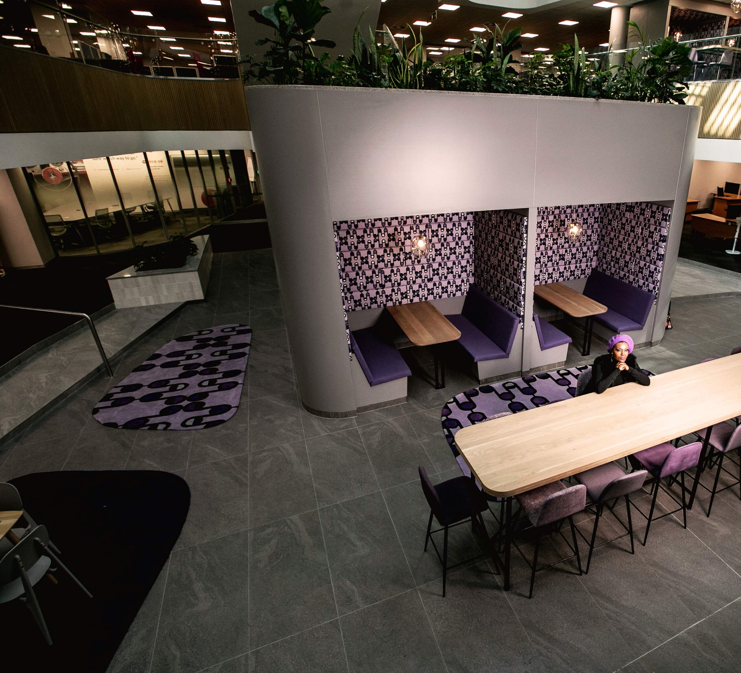
MOMENTUM METROPOLITAN
The Momentum Metropolitan pattern taps into the importance of merging brands.
Their slogan ‘Stronger together’ inspired the idea of creating a pattern which depicts links.
These links that encourage Growth & unity are represented through the links seen in the half and full circles which connect to the main diamond shape in the center. Deliberately blending in some of the lines & circles with the background colour also enhances the pattern and makes it appear more Unified. Upholstery Fabrics printed and installed by Fabric Bank
MOMENTUM PATTERN
Looking at the main heart of Momentum Metropolitan, the idea of having a personal interaction with each client contributes towards the longevity of the Brand and the quality of each client’s journey.
The Momentum pattern focuses on the importance of creating a holistic life right from the beginning…The circles signify the centrality of Momentum, as it highlights how the journey can lead you to a fulfilling Life. The wave-like forms in the outlines depict a sense of movement, which shows the shift between our various life seasons.
As their slogan clearly states “Here for your journey to success” The journey is represented in the curves & wave-like lines reflective of the turbulences experienced in our various paths. These circular solid shapes represent consistency and solidity. of Momentum as a financial institution that encompasses, life, security, investment & wellness resulting in a holistic life.
Custom rugs, Upholstery Fabrics printed and installed by Fabric Bank
Photo credits _ Zac Modirapula
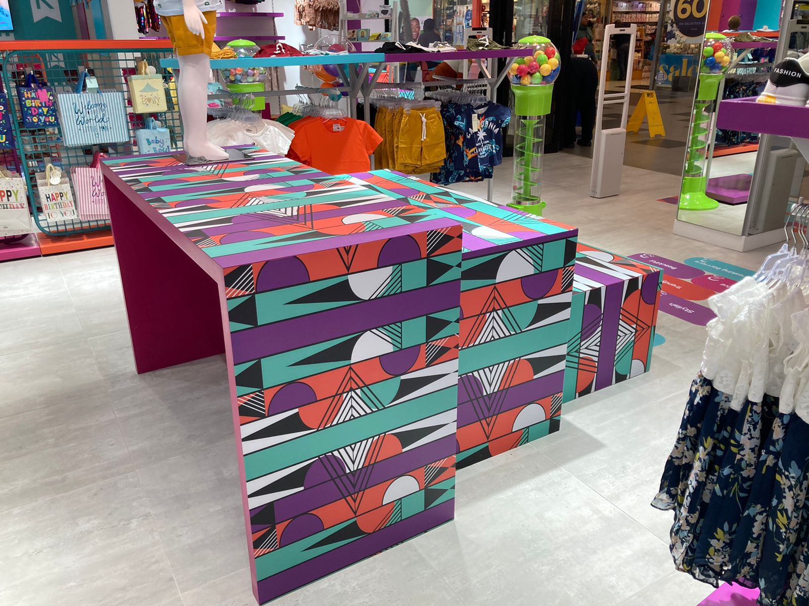
KIDDIES REPUBLIC
The brief given by the Kiddies Republic team was to create a pattern that is vibrant, colourful and speaks to children. As a brand that specializes in children’s clothing – newborn to 12 years, early childhood development is also an important part within their retail space.
The key descriptive words which propelled us to create a composition that embodied the energy and youthfulness of children, were given to the Kiddies Republic team by children from all over South Africa. The words colourful, motivational and little ambassadors of the future were highlighted. The Kiddie’s Republic pattern was inspired by bright colours, familiar shapes such as triangles, circles and diamonds that children can identify with on playgrounds and in the classrooms. The application in the fitting room floors was deliberately made bold to create an inviting vibrant space for children. Their corporate ID colours were incorporated on the print and applied to plinths for the window display and as part their visual merchandising display tables were also included.
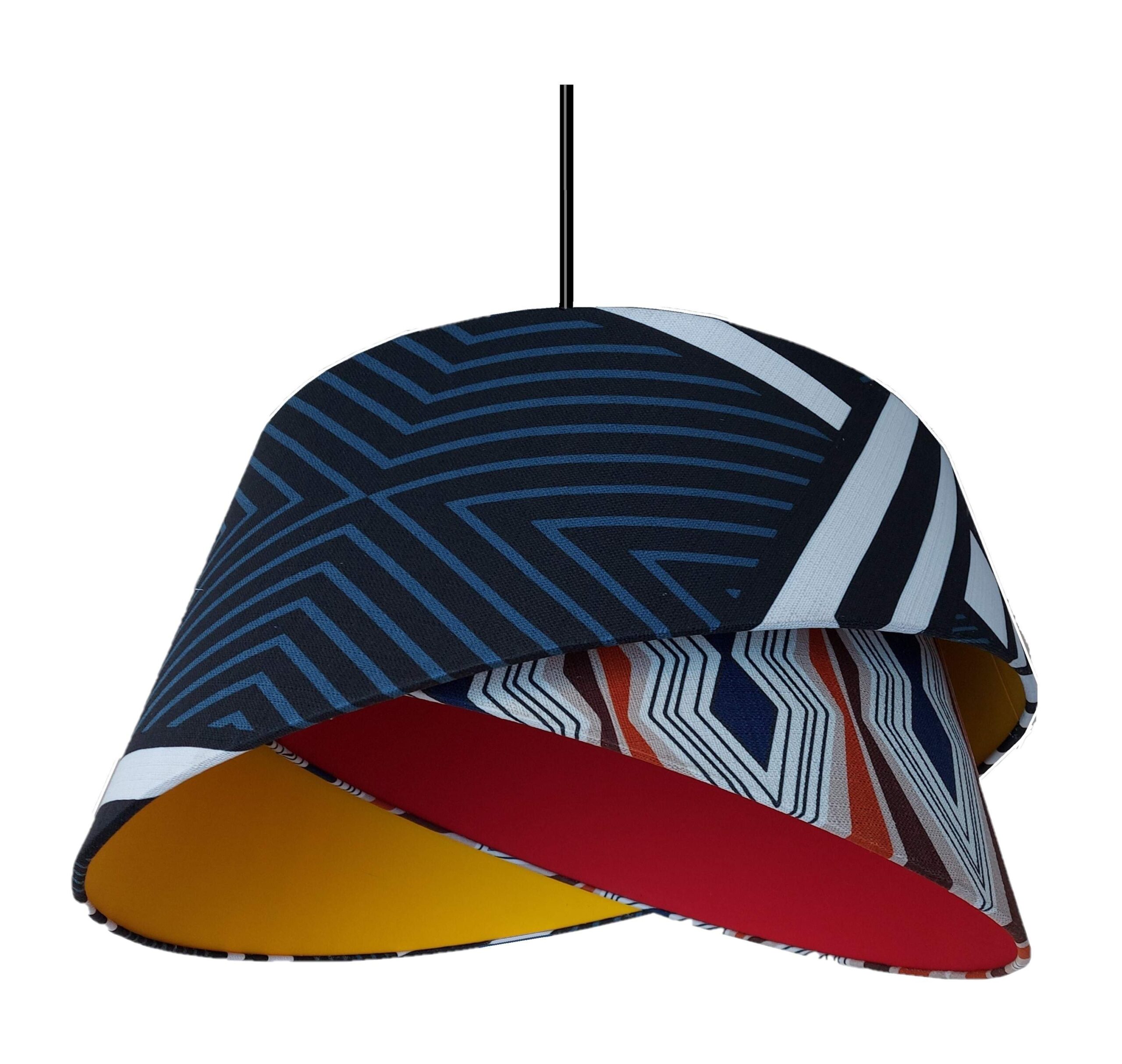
HUNGRY LION
The custom pendant lights were covered partly with the Tribal vibe pattern, which is one of our patterns from the Cohesive Roots collection. The pattern includes the colours black, white and blue forming a strong striped Pattern. The pendants incorporated the corporate ID colours of the franchise with a hint of Modern Africa. All Fabrics were printed by Fabric Bank, and the lights were created by Wire World.
Photo credits _ Wire world